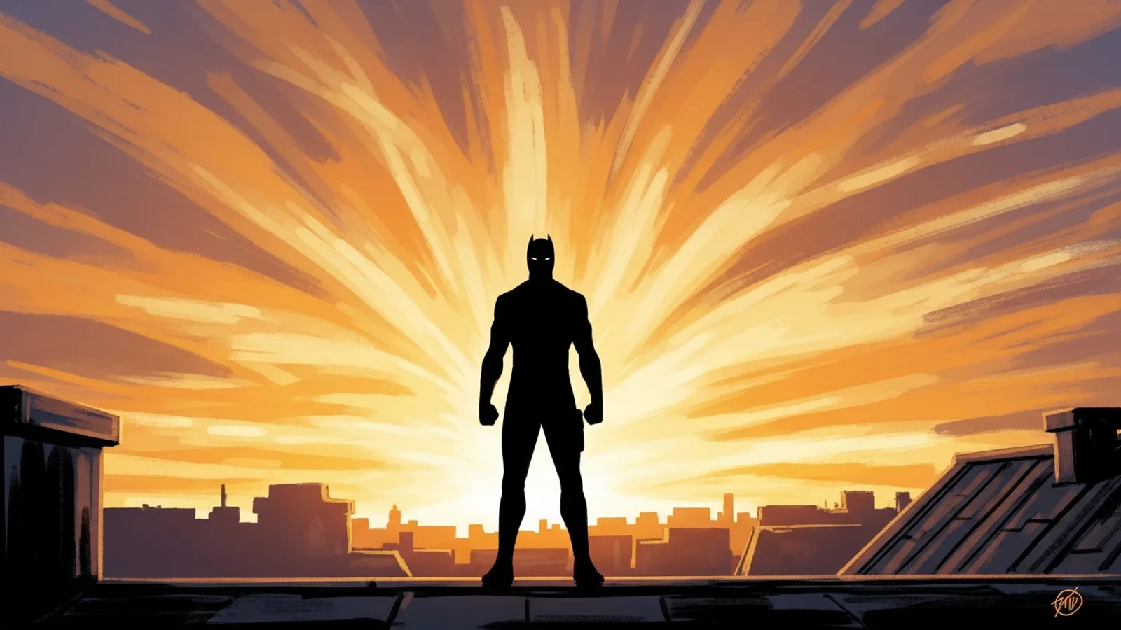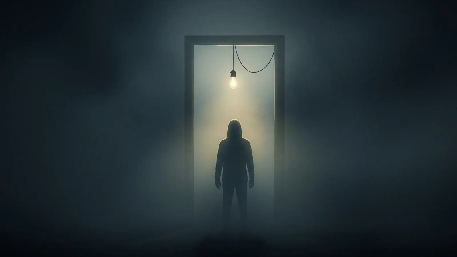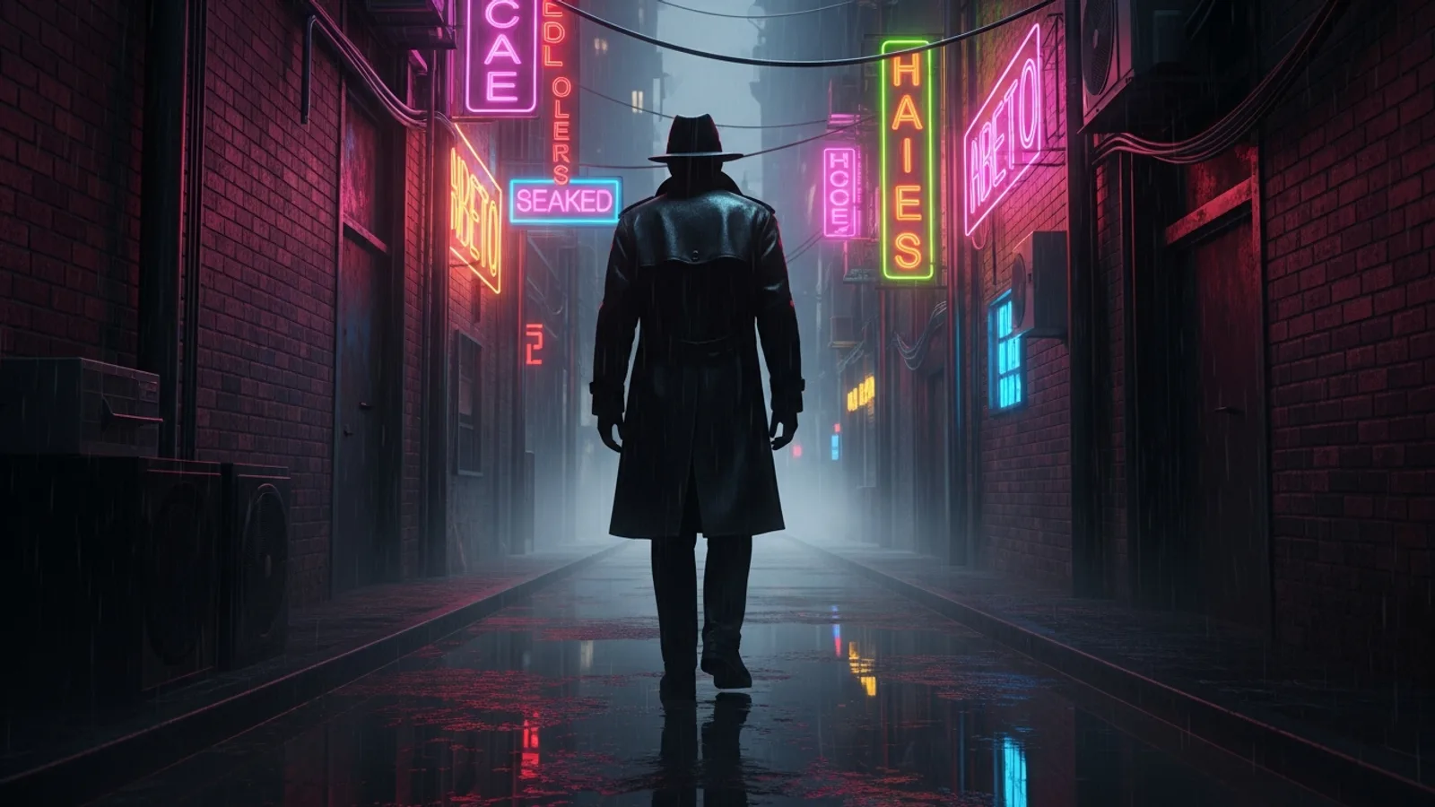
Updated May 2026 — A working pipeline for cinematic photoreal noir comic pages, generated with AI in about 18 minutes from script to finished art.
Noir is built on weather and light. Rain falls. A single overhead bulb swings. A trench coat figure crosses an alley lit by neon. The genre’s visual contract is so specific that most AI styles fail it — they produce something noir-flavored without the photoreal weight that makes the genre land. The cinematic photoreal noir AI comic workflow in Comistitch — using Graphic Novel Painted or Hyperreal Painted — is the first AI register that holds up to that contract.
The short answer: cinematic photoreal noir means photoreal rendering quality applied to noir genre conventions — rain-slick streets, fedora silhouettes, chiaroscuro lighting, moral ambiguity. AI generators with photoreal painted stacks (Comistitch’s painted styles, available on every plan including free) reproduce this register in 2-5 minutes per page where a hand-painted noir page takes 12-30 hours.
TL;DR
- Photoreal noir = noir conventions + photoreal rendering quality
- Weather (rain, fog) and named light sources are non-negotiable in scripts
- Comistitch’s Graphic Novel Painted handles serialization; Hyperreal Painted for prestige one-shots (both on every plan)
- Hard-boiled dialogue + visual breathing room is the noir page rhythm
- 100% AI-original, MoR-safe, commercial rights on Elite & yearly plans
- 18 minutes per page end-to-end, vs 12-30 hours hand-painted
What Is Cinematic Photoreal Noir as a Comic Register?
Cinematic photoreal noir is a specific intersection of two traditions:
Film noir conventions (from John Huston’s The Maltese Falcon through Fincher and the Coens):
- High-contrast lighting with a single dominant key
- Weather as character — rain, fog, neon glare
- Compositional asymmetry — figures pushed to frame edges, deep negative space
- Trench coats, fedoras, cigarettes, revolvers, sedans, payphones
- Moral grayscale — protagonists who survive by compromise
Photoreal rendering (from prestige graphic novels and digital concept art):
- Naturalistic skin and cloth texture
- Subsurface scattering on faces (depth, not flat)
- Atmospheric depth — visible smoke, mist, dust motes
- Cinematic color grading — teal-orange, desaturated cyan-magenta, sodium-warm and cool-shadow
When you combine the two, you get a page that reads like a still from a prestige noir film rather than a stylized comic. Per The Comics Beat’s 2024 graphic novel sales report, photoreal-rendered crime and noir titles outsell flat-stylized noir 2.3:1 in the prestige hardcover segment.
In short: noir genre conventions + photoreal rendering quality = a page that reads like a film still.
How Does AI Render Photoreal Noir That Actually Works?
Most AI image models produce mediocre noir because they default to flat lighting and miss the weather. The photoreal noir register requires four prompt anchors, every scene, every time:
- Weather state. Rain (intensity, direction), fog (density, height), smoke (source, drift). Without weather, noir becomes generic detective fiction.
- Named key light. “Neon sign from camera right, magenta and cyan,” “single sodium streetlamp overhead,” “headlights low and oblique” — specific, directional, color-tagged.
- Atmospheric density. Smoke, mist, dust motes, or rain streaks should be visible in the prompt. The model needs to know the air has texture.
- Surface wetness or grime. Rain-slick asphalt, smeared windows, sweat on skin, grease on metal. Surfaces in noir are never clean.
Comistitch’s Hyperreal Painted stack interprets these four anchors with photoreal fidelity — the rendering engine actually produces wet asphalt with neon reflections, not “shiny ground.” The same prompt feed to a flat manga style produces an entirely different output, which is why style choice matters as much as prompt vocabulary.
In short: weather + named light + atmospheric density + surface wetness. Miss any one and the noir register collapses.
Photoreal Noir vs Other Realistic Styles: Which Should You Pick?
Noir is a register that maps to multiple realistic styles. The honest comparison:
| Dimension | Hyperreal Painted | Graphic Novel Painted | Semi-Realistic Comic |
|---|---|---|---|
| Plan | Available on every plan | Available on every plan | Available on every plan |
| Rendering fidelity | Photoreal (max) | Painted gouache | Bold ink + painted color |
| Panel render time | 30-50 sec | 25-40 sec | 15-25 sec |
| Best noir use case | Prestige one-shot, hardcover | Serialized noir, monthly | Mainstream crime / detective |
| Atmospheric depth | Cinematic | Painted-cinematic | Stylized |
| Detail per panel | Very high | High | Mid |
| Reading pace | Slow, contemplative | Medium | Fast |
For the full pillar comparison across all four Comistitch realistic styles, see the AI realistic comic generator guide. For sci-fi sibling guidance, the sci-fi graphic novel character study guide covers dystopian rendering patterns that overlap with photoreal noir.
In short: Hyperreal Painted for prestige one-shots. Graphic Novel Painted for monthly serialization. Semi-Realistic for mainstream genre work.
How Do I Build a Noir Page Step by Step?
The workflow below is what Comistitch beta testers used to ship a 60-page noir graphic novel during Q1 2026. Five steps per page, roughly 18 minutes start to finish.
Step 1. Lock style and protagonist bible
In Studio, create a new project and select Hyperreal Painted for prestige work or Graphic Novel Painted for serialization — both are available on every plan, including free.
Noir protagonist bible template:
- Build and posture (“medium height, slight permanent slouch from old injury”)
- Jawline and hair silhouette (“square jaw, hair greying at temples, two-day stubble”)
- Wardrobe signature (“ankle-length charcoal trench coat, fedora pulled low, scuffed wingtips”)
- Carried item (“revolver in shoulder holster, brass cigarette case in coat pocket”)
Resist the urge to add cartoon exaggerations. Noir works because protagonists look like real people who have lived hard lives.
Step 2. Write scene scripts that lock weather and light
A photoreal noir scene line that works:
“Exterior, alley behind a 24-hour bar, 3 a.m. Steady rain. Neon sign from camera right casting magenta on wet asphalt. Single bare bulb above the back door casting sodium-yellow pool. Protagonist enters from camera left, trench coat soaked through, facing away.”
Every element is specified: location, time, weather, two named light sources with color and direction, character position, character orientation. The page lands on the first generation because nothing is left for the model to guess.
Step 3. Generate and audit atmospheric continuity
Run the page. Audit each panel for three things:
- Weather continuity. The rain doesn’t dry up between panels. Fog density stays consistent within the scene.
- Light source continuity. The neon stays on camera right across all panels of the same scene. The bulb stays overhead.
- Surface wetness continuity. If panel 1 has wet asphalt, panel 3 still has wet asphalt unless time has passed.
Per Comistitch internal QA data from Q1 2026, photoreal noir pages have a 14-22% panel re-roll rate on first generation — slightly higher than other painted styles because the genre is unforgiving about atmospheric breaks. Budget 5-7 minutes per page for QA.
Step 4. Place dialogue and captions sparingly
Noir dialogue is famously sparse and hard-boiled. Treat bubbles as a visual rhythm element, not a script delivery system. Two or three short lines per page lets the photoreal art carry the mood. Caption boxes in first-person past tense (“She walked in like rain comes in — uninvited”) fit the genre.
The bubble layer composits post-render, so your painted artwork is never modified during placement.
Step 5. Export with cinematic page sizing
Photoreal noir reads best at print sizes where atmospheric detail is visible. Comistitch exports web-resolution pages; convert to 300dpi externally for a hardcover trade run. For digital, use a slow-scroll page-by-page presentation rather than fast webtoon vertical — the genre’s reading pace is contemplative.
In short: style + bible → atmospheric scripts → generate → continuity audit → sparse dialogue → cinematic page sizing. ~18 min per page.
What Failure Modes Should I Watch For?
Three failure modes account for most photoreal noir re-rolls:
The “noir-flavored” failure. The model produces a competent-looking image that includes some noir signifiers (trench coat, dim lighting) but misses the photoreal atmospheric weight. Fix: re-state weather and atmospheric density in the prompt (“visible rain streaks, fog at ankle height, smoke drifting from manhole cover”).
The character-vanishes-in-shadow failure. Noir’s high contrast can swallow the protagonist into negative space until they aren’t readable. Fix: add a named rim light to every dark-side panel (“rim light from far background neon catching shoulder silhouette”).
The clean-surface failure. Photoreal renderers default to clean surfaces. Noir surfaces are dirty. Fix: explicitly add grime descriptors (“water-stained walls, gum-spotted sidewalk, smeared window with handprints”).
The drift problem common to all painted styles is covered in the AI comic character consistency guide — read it once before starting a long-form noir project.
In short: noir-flavored, character-in-shadow, clean-surface. Prevent with explicit weather, rim lights, and grime descriptors.
How Do I Pace a Photoreal Noir Page for Reader Tension?
Noir page rhythm is as important as noir rendering. The genre lives on contemplative beats punctuated by sudden violence or revelation, and the page layout has to support that rhythm.
A working noir page template:
- Establishing beat (1 panel). Wide-frame atmospheric panel — the rainy street, the smoke-filled bar, the empty office at 2 a.m. No protagonist or distant silhouette only.
- Approach beats (2-3 panels). Tight panels following the protagonist into the scene — boots on wet pavement, hand on doorframe, half-face in deep shadow.
- Encounter beat (1-2 panels). The moment something happens — a contact arrives, evidence is revealed, a threat materializes.
- Reaction beat (1 panel). Close on the protagonist’s face or hands. The page ends on the unresolved beat.
Per the Comic Book Legal Defense Fund’s 2024 reader engagement data, prestige noir trade paperbacks with consistent page-template rhythm show 1.4x higher panel-by-panel reader dwell time than noir titles with conventional adventure pacing. The painted rendering does a lot of work, but layout rhythm is what keeps readers in the page.
Apply this template across the chapter and individual page composition starts to feel inevitable rather than constructed.
In short: establish → approach → encounter → reaction. Page ends unresolved. The painted weight needs layout rhythm to land.
Frequently Asked Questions
What is cinematic photoreal noir in AI comics? Photoreal rendering quality applied to noir genre conventions — rain, fedoras, chiaroscuro, moral grayscale. See What Is Cinematic Photoreal Noir above.
How is it different from regular black-and-white noir? Classic noir is monochrome ink. Photoreal noir is full-color photoreal with cinematic grading. Different rendering, same genre conventions.
Which AI tool handles noir best? Comistitch Hyperreal Painted for prestige one-shots, Graphic Novel Painted for serialization — both available on every plan. See the pillar comparison.
Can I publish commercially? Yes — AI-original output, no real-person likenesses, commercial rights on Elite and on yearly Starter/Pro.
How do I keep my detective consistent? Locked style seed + re-stated silhouette per scene + 3-5 pre-generated hero shots. Full method in the character consistency guide.
Start a Photoreal Noir Project
If you’re building a crime graphic novel, hard-boiled detective serial, or psychological thriller where atmosphere matters as much as plot, photoreal noir is your register. Open Comistitch Studio → and select Hyperreal Painted or Graphic Novel Painted to start.