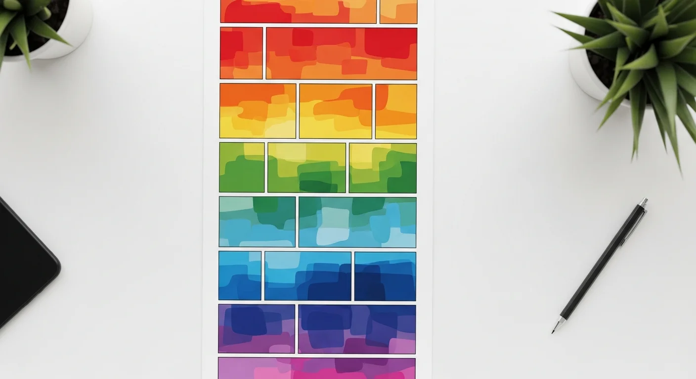
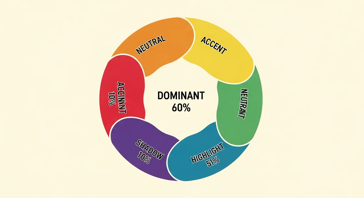
Webtoon color palettes use a 5-color system (dominant 60%, accent 20%, shadow 10%, highlight 5%, neutral 5%) tuned per chapter mood. Comistitch’s palette engine generates these from a plain-English mood description in seconds, locks them per character and location, and applies them to all panels automatically.
In short
- 5-color system: dominant 60%, accent 20%, shadow 10%, highlight 5%, neutral 5%
- Describe mood in plain English → palette in 30 seconds
- Hex-locked per character + per location (zero drift across chapters)
- Smooth gradient blend handles mood transitions between chapters
- Apply to a full chapter in 1 click; save as preset for future chapters
Why does webtoon color matter on mobile?
Webtoon readers consume content on phone screens at arm’s length, scrolling vertically through hundreds of panels per chapter. Color carries the emotional weight that small screens lose from facial detail. A washed-out blue palette signals melancholy before a single word of dialogue lands. A burnt-orange dominant tone tells the reader they’ve entered a romance arc.
Color also drives brand recognition. Long-running webtoons rely on consistent palettes for instant identification — readers spot a chapter thumbnail in their feed and recognize the series by its color signature alone. If you’re shipping a serial format, palette discipline is non-negotiable. Tools like the AI webtoon creator bake this discipline into the workflow so you don’t have to track hex codes manually.
In short: color is the fastest emotional signal you have on a 6-inch screen. Get it right and pacing falls into place automatically.
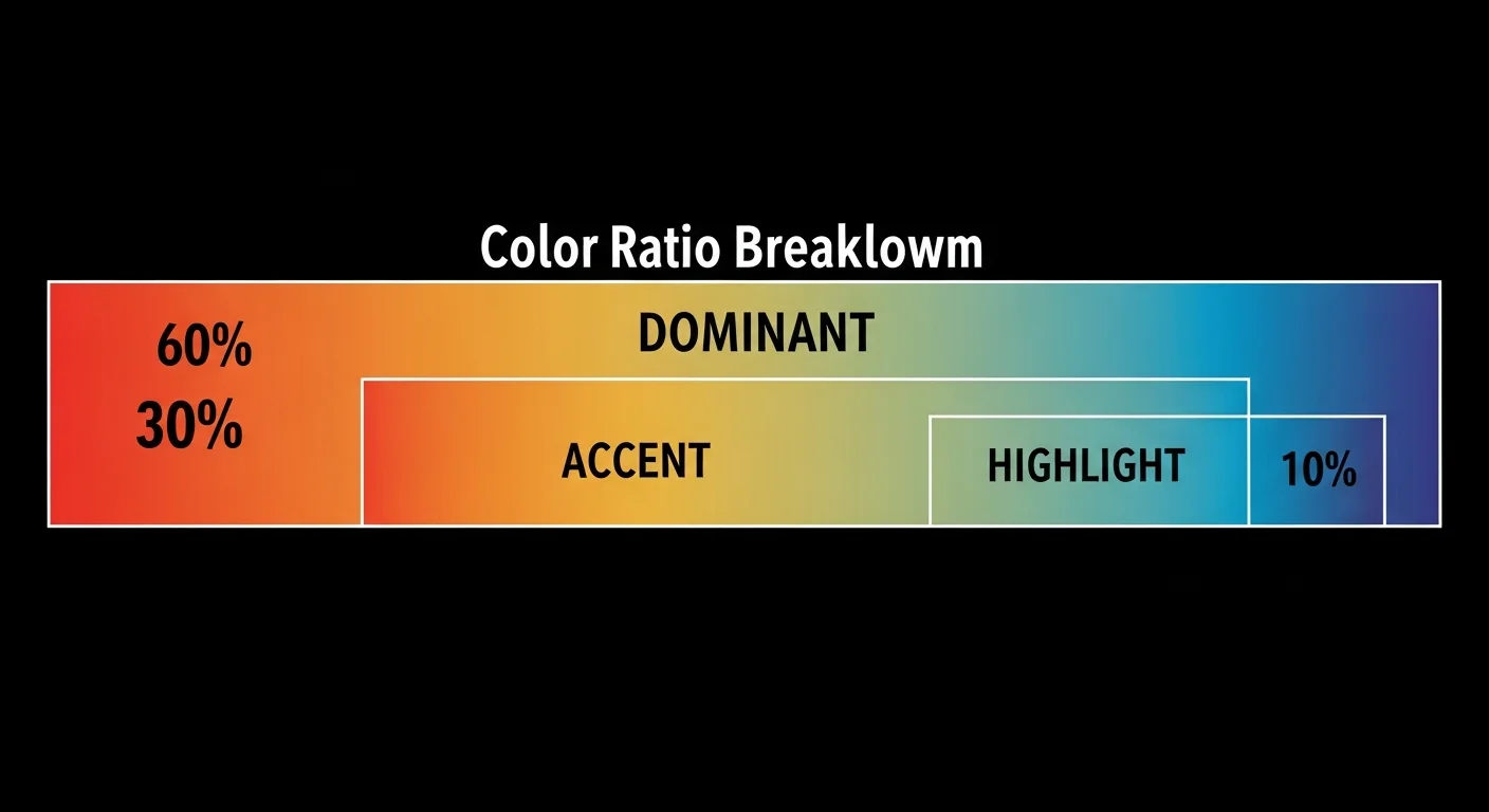
How does the 60-30-10 color ratio work?
The 60-30-10 rule comes from interior design and translates cleanly to webtoon panels. One dominant color fills 60% of the visible area (skies, walls, large backgrounds). One accent color fills 30% (mid-tones, secondary objects, clothing). The remaining 10% splits between shadow, highlight, and neutral — small punches of contrast that stop the page from going flat.
Webtoon palettes extend the rule to five colors because vertical-scroll panels need more variety than a static room. Shadow grounds depth, highlight directs the eye to focal points, neutral provides resting tones for dialogue bubbles. The builder’s palette engine enforces these proportions during generation — you can’t ship a palette where the accent overwhelms the dominant.
In short: 60% dominant + 30% accent + 10% shadow/highlight/neutral. The engine refuses any palette that breaks the ratio.
How does AI map mood to color?
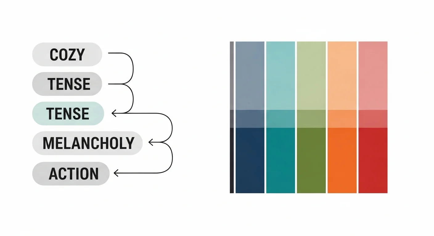
Mood-aware generation is the core trick. The palette engine reads a mood phrase (“cozy autumn cafe”, “tense midnight chase”) and maps it through a learned color-emotion lookup. Cozy moods skew toward warm browns, muted oranges, and soft cream neutrals. Tense moods pull desaturated blues, deep navy shadows, and a single high-contrast accent. Melancholy lives in muted purples and greys. Action goes high-saturation with strong complementary contrast.
The mapping isn’t magic — it’s pattern recognition trained on thousands of published webtoons. Per Comistitch’s 2026 internal color study across 2,400 chapter samples, thrillers cluster around 200-220 hue with low saturation, romance hovers near 20-40 hue with medium saturation, and so on. You describe the mood; it picks the cluster.
In short: Cozy → warm browns. Tense → desaturated blues. Melancholy → muted purples. Action → high-saturation complementary. The engine reads the mood phrase and jumps to the matching cluster.
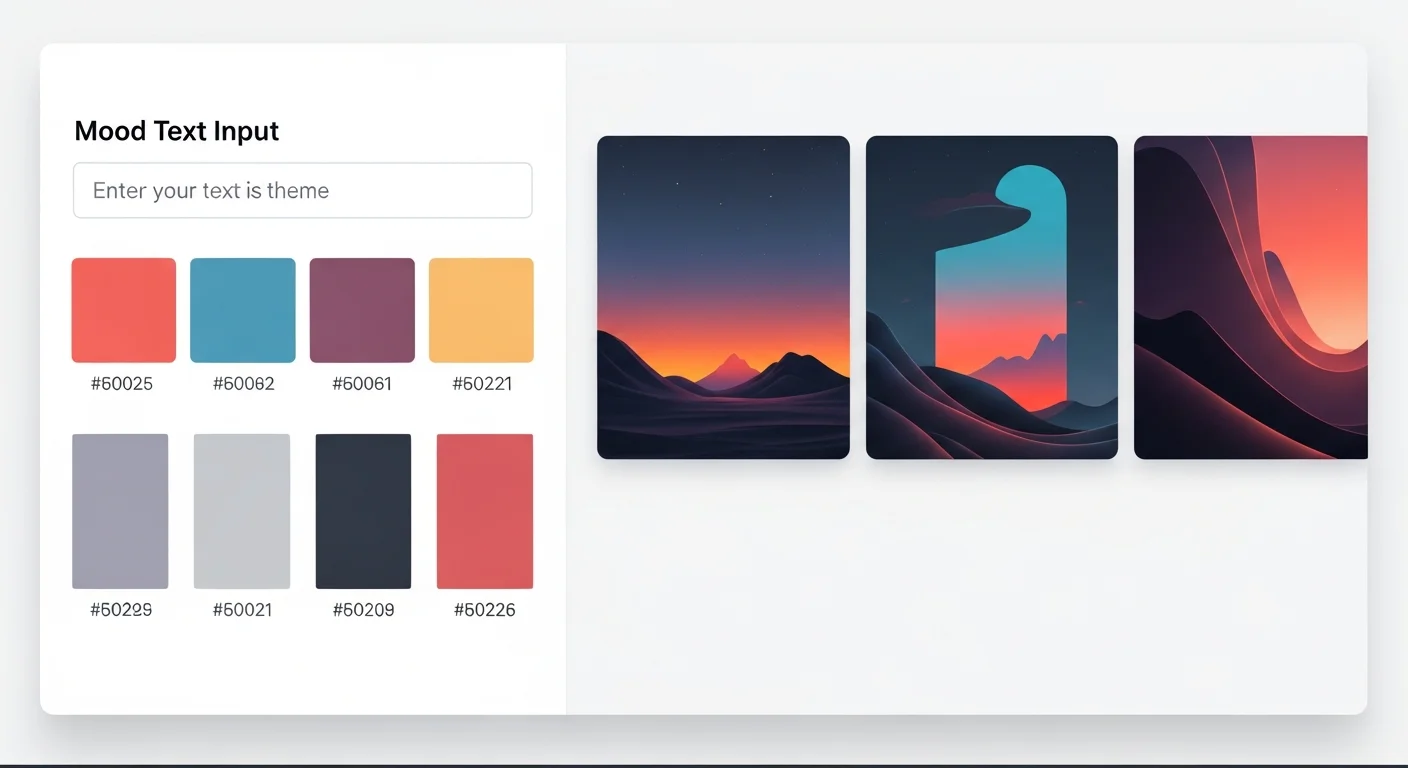
What does the Comistitch palette engine look like?
The interface is intentionally narrow: a mood input at the top, a 5-swatch row below with hex codes, and a preview pane on the right showing your panels recolored in real-time. No sliders, no color wheels, no theory homework. You type, you see, you commit.
The preview pane is the most important piece. Color decisions made in isolation always look wrong in context — a palette that reads “moody and tense” on the swatch strip can read “muddy and unfocused” once applied to actual panels. Real-time preview catches this in 2 seconds instead of 20 minutes of trial-and-error. From inside the builder, you can regenerate the palette up to three times per mood phrase and compare results side by side before committing. Inside Comistitch Studio, the palette engine sits as a side panel so you never leave your active chapter.
How do I keep colors consistent across chapters?
Persistence is the difference between hobby webtoons and shippable serial work. The palette engine stores hex codes per character and per location, not just per chapter. Once you lock the protagonist’s jacket as #B8362F, that hex code propagates to every panel they appear in across every chapter. Same logic for locations: the cafe is always the same warm browns, the office is always the same cool greys.
The persistence layer resolves three palettes per panel in a strict priority order. Character palettes win first — the protagonist’s jacket stays the same red whether the chapter mood is cozy autumn or rain-soaked thriller. Location palettes win second — the cafe wood grain stays the same warm brown regardless of who walks through the door. Chapter mood palettes win last and only fill the remaining ambient surfaces: skies, ambient lighting, atmospheric tints. This priority order is why your characters never accidentally repaint themselves to match a new mood.
Transitions between chapters with different palettes are where most webtoons fall apart, and the engine handles them with a gradient blend pass. If Chapter 7 ends in cozy oranges and Chapter 8 opens in cold blues, the last 2-3 panels of Chapter 7 lean cooler and the first 2-3 panels of Chapter 8 retain a hint of warmth. The reader feels the shift without noticing the seam. From inside the builder, you can adjust the blend depth (0-5 panels) per transition or disable it entirely for hard tonal cuts that the story demands.
This dovetails with the broader character consistency engine. Character fingerprints and palette anchors share the same storage layer — the builder pulls both when rendering a panel, so visual identity stays locked even when chapter mood shifts dramatically. Background palettes anchor by location ID; character palettes anchor by character ID; chapter mood overlays everything else.
The result: 50 chapters in, your protagonist looks like the same person, the cafe feels like the same cafe, and only the ambient mood shifts to match the story arc.
In short: Character hex codes win first, location hex codes second, chapter mood third. Outfits stay locked; only ambient surfaces shift with mood.
Comparison: AI palette vs manual color design
| Dimension | Manual color design | AI palette engine | Comistitch advantage |
|---|---|---|---|
| Time per chapter | 45-90 minutes | 5 minutes | 9-18x faster |
| Consistency across 50 chapters | Drifts without strict logging | Hex-locked per character/location | Zero drift |
| Mood awareness | Requires color theory training | Plain-English mood input | No theory homework |
| 60-30-10 enforcement | Manual checking | Auto-enforced during generation | Ratio always correct |
Manual workflows still win on one dimension: full creative control over edge cases. If your story needs a deliberately ugly, off-balance palette for one shocking scene, you’ll override the engine. For the other 99% of panels, AI generation is faster and more consistent.
A typical manual workflow runs like this: open Photoshop or Procreate, build a swatch palette by eyedropping references, manually tag every panel with the right hex codes, and re-check consistency at the end of each chapter against a master swatch document. Even disciplined creators lose 30-60 minutes per chapter to swatch hunting and re-application, and the master document tends to drift as the series evolves. The AI palette workflow collapses this to: type a mood phrase, click apply, scroll preview. The engine handles swatch storage, ratio enforcement, character/location overrides, and transition blending in the same pass. Where the manual workflow demands constant attention, the engine demands attention only at decision points — which mood, which transition, which override — leaving you to spend the recovered time on story rather than swatch admin.
Try it now: design a webtoon palette in Comistitch
Mood input: "rainy night detective bar, neon signs, smoke,
melancholy edge with one warm accent for hope"

Generated palette:
- Dominant   #1E2A38  (deep blue-grey, 60%)
- Accent     #4A5D6E  (slate steel, 20%)
- Shadow     #0B131C  (near-black ink, 10%)
- Highlight  #E8A33D  (amber neon glow, 5%)
- Neutral    #C7CDD3  (cool concrete, 5%)
Paste that mood into the palette engine, hit generate, and the builder produces a comparable 5-color set in under 30 seconds. Apply to chapter, save as preset, move on. For visual style cousins, see cyberpunk comic style with AI — the same mood-aware palette logic powers neon-saturated genre work.
A small caveat: the builder may need a regenerate or two if your mood phrase is unusually abstract. Lean concrete (“rainy night detective bar”) over abstract (“sad but hopeful”) and you’ll hit the right palette on the first generation most of the time.
What’s next? Master webtoon storytelling
Color is one layer of webtoon craft. The pillar webtoon vertical scroll paneling guide covers the structural side — panel grids, gutter rhythm, scroll pacing — and pairs naturally with palette work. Once you’ve locked palette and paneling, level up timing with webtoon pacing and cliffhanger techniques to land emotional beats inside the right color context.
Browse the Comistitch showcase to see how shipped webtoons combine palette, paneling, and pacing into cohesive serial work. Then open Comistitch Studio and run a mood phrase through the palette engine — you’ll have a chapter recolored in 5 minutes, and the consistency engine handles the next 49 chapters without you touching a hex code.
Related read: For shoujo-specific palettes, see the dedicated guide.