Updated May 2026
Cyberpunk lives or dies on a single visual contract — neon against pitch black, rain against chrome, the small human body dwarfed by the megacorporate skyline. Indie creators love the genre because every panel earns its mood from atmosphere alone, but reproducing that atmosphere by hand demands lighting fundamentals, perspective grids, and a paint workflow that takes years to refine. A modern cyberpunk comic style ai pipeline collapses that learning curve. You write the scene, lock the protagonist, and the panel ships looking like the inside of a rain-soaked megacity at 3 a.m.
On this page: the palette anchor, the panel rhythm, prompt scaffolds for mood, character archetypes that stay original, world-building rules, consistency tactics, pacing for action vs. introspection, vertical-webtoon publishing notes, a comparison table, and FAQ.
What Cyberpunk Comic Style AI Actually Means
The label gets thrown around loosely, so let’s tighten it. Cyberpunk as a comic style is not just “sci-fi with neon.” It carries five non-negotiable visual cues — high-contrast lighting with chromatic accents, dense vertical urban geometry, signs of corporate-state collapse (graffiti, broken signage, refugee crowds), transhumanist body modification, and rain or smoke as a near-permanent atmospheric layer. AI-driven generation works for the genre because each of those cues is renderable from a short prompt set, and the composition rules are consistent enough that a model can learn them.
Comistitch’s panel canvas treats cyberpunk as a configurable preset rather than a single look. You decide whether the era leans 1980s neon-noir, 2000s digital dystopia, or post-collapse refugee chic, and the lighting model and environmental detail follow. The same protagonist can walk through a corporate atrium, a black-market clinic, and a rooftop chase without you re-prompting the genre on every page.
Defining the Cyberpunk Palette — Neon, Black, and the Magenta Anchor
A cyberpunk page reads from across the room because of color hierarchy. Treat the palette as a layered stack, not a free-for-all.
Layer one — value floor. Near-black (not pure black) as the dominant value across roughly 50 to 60 percent of every panel. This is the asphalt, the alley wall, the unlit half of every face. It is what the neon plays against.
Layer two — primary accent. One saturated hue carries the page identity. Magenta or hot pink is the canonical choice for neon-noir; cyan reads cooler and more clinical; acid green leans toxic and biotech-coded. Pick one, use it for 20 to 25 percent of the panel area, and resist mixing two primaries on the same page.
Layer three — warm light pools. Sodium-yellow streetlights, candle-orange interior bulbs, and warm screen glow give the eye relief from the dominant cool accent. Roughly 10 to 15 percent of each panel.
Layer four — pure white. Reserve it. White is the muzzle flash, the rain streak, the active hologram surface, the screen the protagonist is staring into. Used sparingly, white draws the reader’s eye exactly where the panel needs it.
This stack survives translation to grayscale and to the small thumbnail sizes that matter for webtoon discovery feeds.
Panel Rhythm — Claustrophobia, Splash, and Motion
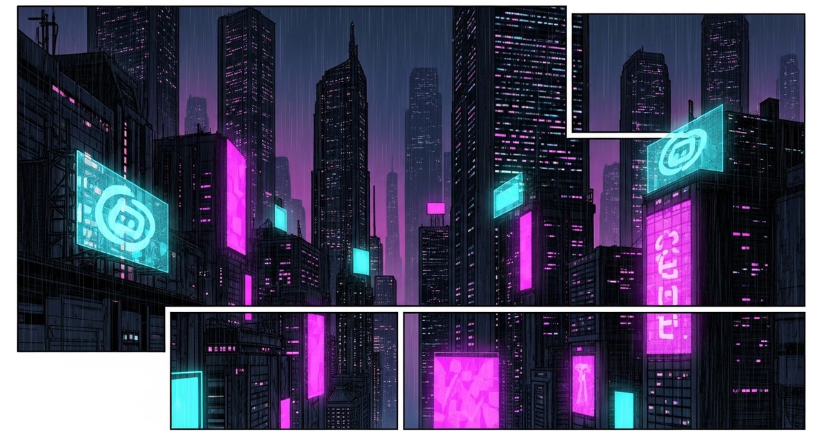
Cyberpunk pages have a recognizable cadence. Tight panels for dialogue and dread, splash panels for the city reveal, hard motion lines for the chase. Get this rhythm right and the genre lands even with mediocre rendering.
Claustrophobic close-ups dominate dialogue and introspection sequences. Stack two or three narrow panels — a half-face lit from below by a phone screen, a hand on a bar, a silhouette in a doorway — to compress the reader into the scene’s tension.
Splash panels carry the world. Use them for the first city reveal, the descent into the underbelly, and the chapter-ending pull-back. A splash earns its real estate when it shows scale the reader cannot otherwise feel — a hundred floors of neon billboards rising into smog, a crowd seen from above.
Motion-line sequences handle the action. Cyberpunk chases happen on motorcycles, in service tunnels, and across rooftops — settings where speed and verticality combine. Use diagonal motion lines, asymmetrical panel shapes, and one strong silhouette per panel to keep the eye moving.
Prompting the Mood — Style Words That Actually Land
Prompt vocabulary matters. Vague mood requests produce vague output; specific lighting and atmosphere terms produce panels that read as cyberpunk on the first generation.
A working prompt scaffold looks like this — environment first, then lighting, then atmosphere, then mood. “A rain-slick alley behind a 24-hour ramen stall. Magenta and cyan neon from the storefront, sodium-yellow from a flickering streetlamp overhead. Steam rises from a sewer grate. Mood: tired, wary, end-of-shift.” Roughly thirty words, four cues, one emotional tag.
Words that consistently land include: rain-slick, neon-saturated, rim-lit, volumetric, holographic, smog-diffused, chrome-reflective, graffiti-tagged, retrofitted, brutalist, oversaturated, bleached. Words to avoid because they confuse the model: futuristic (too vague), cool (interpreted literally as temperature), aesthetic (no visual content).
For a deeper walk-through of prompt structure across genres, the comic creation walkthrough covers the full scene-script-to-panel pipeline that cyberpunk inherits.
Anti-Hero Archetypes — Original Characters, Not Impersonations
The era you are referencing produced iconic characters, but you should not draw them. Build original protagonists who carry the era’s visual energy without invoking specific names. Here are five archetype scaffolds that work without crossing the IP line.
- The decommissioned courier. Former corporate runner, now off-grid. Visual signature: scarred forearm where the company chip was extracted, jacket two sizes too big, prosthetic eye that shows through goggles. Drives the plot through deliveries that are never just deliveries.
- The street medic. Patches up the people who cannot afford corporate care. Visual signature: surgical mask down around the neck, blood-stained gloves, tactical satchel of black-market pharma. Knows everyone and owes everyone.
- The decker turned dropout. Used to break corporate networks; now hides from the same corps. Visual signature: wraparound visor, fiber-optic hair extensions, three layers of jackets to defeat scanners.
- The ronin enforcer. Freelance muscle for whoever pays. Visual signature: long coat, single visible blade, cybernetic jaw plate. Speaks rarely. Codes by an internal rule the reader has to figure out.
- The idol with a glitch. Pop star whose synthetic vocal track is starting to corrupt. Visual signature: stage costume layered over street clothes, one eye replaced with a broadcast-grade camera. The glitch is the plot.
Each of these reads as cyberpunk-era at first glance and stays original to your project. None of them require naming a known character to work.
World-Building — The Megacity as a Character
Cyberpunk’s setting is a character, not a backdrop. A few rules turn a generic city into a world readers want to return to.
Verticality earns the panel. A flat horizon is rarely cyberpunk. Stack the city — undercity, street level, midrise, corporate towers, pristine penthouses, rooftop gardens — and stage scenes that move between layers. Class lives at altitude.
Density beats novelty. Twenty believable signs in three readable languages will sell a megacity better than one perfect futuristic gadget. Layer graffiti over corporate ads over neon over taped-up missing-person flyers.
Weather is mood. Rain compresses the lighting and reflects the neon. Smog softens silhouettes and sells distance. Snow turns the genre cold and Eastern-European. Pick one weather mode per chapter and commit to it.
Make the corporates anonymous. Invent your own megacorps with two-syllable names — Yenkō, Veridian, NoxCorp. Logos appear on coffee cups, building tops, jackets, and police drones. The repetition does world-building without dialogue.
For a broader sci-fi treatment of world-building patterns, the AI sci-fi comic style page covers the related but distinct conventions of space opera, hard SF, and post-human fiction. If your project leans more toward shadow play and detective archetypes than neon spectacle, also study the AI comic noir style page — its lighting discipline carries directly into cyberpunk’s wet-street nightscapes.
Keeping the Protagonist Consistent Across Pages
The single biggest failure mode in AI comic generation is character drift — your cyberpunk lead looks subtly different on every page until they no longer feel like the same person. Cyberpunk amplifies the problem because high-contrast lighting hides facial geometry that anchors recognition in flatter styles.
Three tactics solve it. Lock a detailed character sheet at chapter start, including face geometry, hair silhouette, signature jacket, and one non-negotiable accessory (visor, scar, glove, prosthetic). Restate the silhouette in every scene prompt — “the courier in the oversized jacket and goggles” rather than “the courier.” And generate three to five hero shots in different lighting before you start the chapter, so you know the character holds up under neon, daylight, and total darkness.
The full method, including how the builder pins the reference and how to recover when drift starts, is laid out in the character consistency guide — read it once before you start a long-form cyberpunk project.
Pacing — Action vs. Introspection
Cyberpunk runs hot when it alternates. Pure action burns the reader out; pure introspection loses them. The genre’s best comics shift between modes on a roughly 70-30 split, with introspection often carried by environmental panels rather than dialogue.
A working chapter rhythm: open with three to five environmental panels (rain, neon, the city waking up); shift to a four-panel dialogue scene that establishes the chapter’s question; deliver an eight-to-twelve panel action sequence; cool down with a two-panel introspective beat (protagonist alone, ambient light, no dialogue); close with a hook panel that escalates the next chapter’s stakes.
The introspective beats are where cyberpunk earns its soul. Do not skip them. A protagonist staring at rain on glass for two panels does more for character investment than any amount of exposition.
Cyberpunk vs. Noir vs. Sci-Fi — Quick Comparison
The three styles overlap and creators often confuse them. Here is the working distinction.
| Dimension | Cyberpunk | Noir | Sci-Fi |
|---|---|---|---|
| Dominant palette | Neon magenta + cyan on near-black | High-contrast B&W with selective hue | Cool blues, whites, metallics |
| Lighting model | Rim-lit, rain-diffused, oversaturated | Hard single-source, deep shadow | Bright, even, reflective |
| Setting era | Near-future megacity, post-collapse | Mid-century urban, neo-noir present | Far-future, off-world, post-human |
| Body language | Cybernetic, transhumanist, modified | Untouched human, suit-coded | Suited, uniformed, posthuman |
| Plot engine | Corporate vs. street | Crime vs. detective | Discovery vs. unknown |
| Panel rhythm | Vertical, claustrophobic, splash | Wide, horizontal, slow | Mixed, exploratory |
| Mood anchor | Resigned defiance | Moral compromise | Curiosity, awe, dread |
Most cyberpunk projects borrow noir’s shadow discipline and sci-fi’s worldbuilding patience while keeping the neon palette as their signature. Treat this table as a starting point, not a constraint.
Publishing on Vertical Webtoon Platforms
Cyberpunk and the vertical scroll were made for each other. The genre’s verticality, signage density, and motion-heavy chase sequences map cleanly onto the scroll-driven format. A few format-specific notes turn that into actual reads.
Lead with a splash that sets the city — readers decide in two seconds whether to keep scrolling, and a strong cyberpunk vertical lands that decision instantly. Use full-bleed neon billboards as scene transitions; they double as ad-like attention resets. Keep dialogue panels at half-screen height so the eye does not get trapped. End every episode on a cliffhanger panel framed against a holographic skyline — it is a genre cliché for a reason.
A complete vertical workflow, including export sizing and chapter cadence, is documented in the text-to-webtoon walkthrough. Cyberpunk creators should follow it as-is, with extra attention to color calibration on dark-mode reader screens.
Common Pitfalls and How to Avoid Them
Five mistakes show up in almost every first cyberpunk attempt.
Over-saturating every panel. If every panel is at neon maximum, nothing reads as bright. Pick the two or three “neon hero” panels per page and let the rest sit in shadow.
Generic megacorp logos. Inventing your own corp names and visual identity is fifteen minutes of work that pays off across the entire project. Skip it and the world feels rented.
Treating cyberpunk as “sci-fi with neon.” It is a specific subgenre with class-conflict politics and transhumanist themes baked in. Strip those out and the visuals start to feel decorative.
Inconsistent rain or weather. Rain in panel one and clear sky in panel three breaks the chapter mood. Pick a weather mode and hold it across the scene.
Stealing iconic characters. Even small references to known characters create takedown risk and reduce your work to fan art. Build originals; the genre is bigger than its most famous protagonists.
Start Your Cyberpunk Comic Today
The cyberpunk era’s visual language — neon noir, rain-slick streets, megacorporate dread — is one of the most rewarding aesthetics to work in, and one of the hardest to render by hand. From inside the builder, a chapter that would take a solo artist weeks compiles in an afternoon. Lock your protagonist, draft your scene scripts, pick your weather mode, and ship the first chapter before you over-plan the second.
Start a cyberpunk project on Comistitch — first chapter free, no credit card.
Cyberpunk comic generation tested in the Comistitch panel canvas, May 2026 release. Style cues and prompt vocabulary derived from the active panel canvas, not from any specific copyrighted character or franchise.