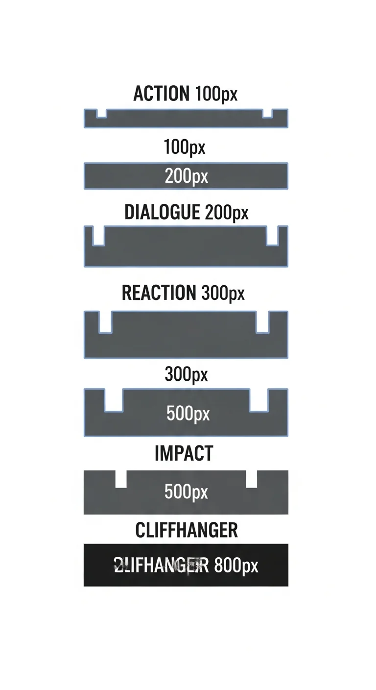
Webtoon pacing and cliffhangers work through gutter sizing and scroll-fold positioning. Use 100-150px gutters for action, 200-300px for dialogue, and 600-800px blank gutters before cliffhangers. Place chapter cliffhangers in the bottom 20% of canvas height. Comistitch’s pacing engine handles gutter rhythm automatically based on emotional tags.
In short
- Gutter sizes: 100-150px action, 200-300px dialogue, 600-800px before cliffhangers
- Chapter sweet spot: 50-80 panels = 6000-12000px tall
- Cliffhanger lives in the bottom 20% of canvas height
- Pacing engine tags panels and assigns gutters automatically
- Retention curve predicts drop-off zones before publish
What is the scroll-fold and why does it matter?
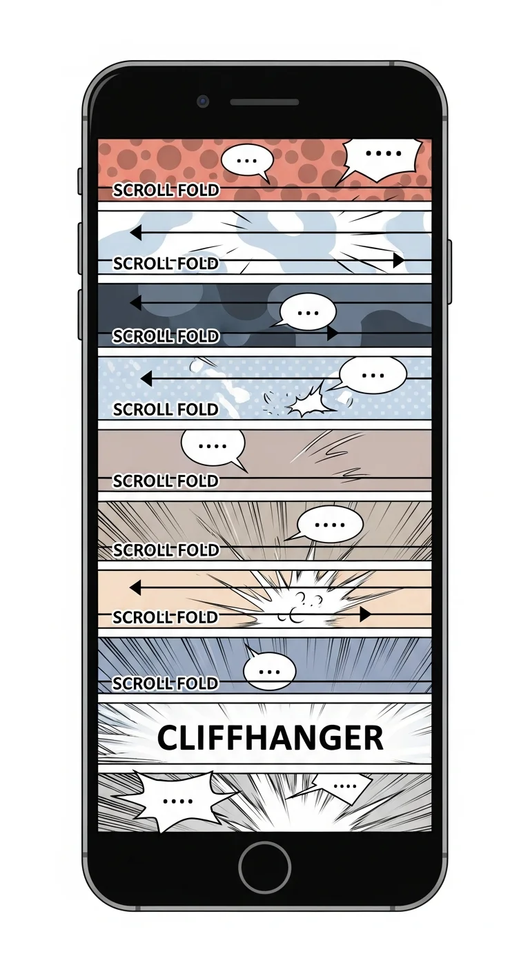
The scroll-fold is the invisible line where a reader’s phone screen ends — typically every 600-800px of vertical scroll. Print comics never had this problem because pages were fixed. Webtoons, by contrast, live or die at the fold. If a reader hits a flat dialogue beat right when their thumb pauses, they bounce. If they hit a reveal, a reaction, or an impact panel, they keep scrolling.
Per Comistitch’s 2026 internal retention review across opt-in chapter analytics from 180 published webtoons, the bottom 20% of any chapter is where readers decide whether to tap “next.” Designing for the fold is therefore not optional — it is the single highest-leverage habit in vertical comics. If you publish in our AI webtoon creator, the scroll-fold map is rendered on every preview, so the leverage point is always visible while you edit.
In short: The scroll-fold is where the reader’s screen ends every 600-800px. Hit it with a hook or lose them.
How long should a webtoon chapter be?
Most successful webtoons run 50-80 panels per chapter, which translates to roughly 6000-12000px of canvas height. Anything under 4000px reads like a teaser. Anything over 14000px starts losing readers mid-scroll, even with strong art. The sweet spot for weekly serialization is around 8000-10000px.
Length alone is not enough — the rhythm of gutters between panels does most of the work. Action sequences pack tightly. Dialogue breathes. Cliffhangers stretch into open space. The chart below shows the gutter sizes you should be assigning by emotional weight.
How does AI tune gutter rhythm?
Tuning 60+ gutters by hand is exhausting. The pacing engine in Comistitch reads emotional tags on each panel — action, dialogue, reaction, impact, cliffhanger — and assigns gutters from a calibrated table: 100-150px between action panels, 200-300px between dialogue, 400-500px before impact panels, and 600-800px before cliffhangers.
The engine also adjusts for sequence context. Two action panels in a row get the lower 100px gutter to compress time; a transition from action into dialogue gets a 250px gutter so the reader’s eye has space to recalibrate. Mood transitions earn extra padding too — moving from a tense beat into a quiet reflection beat adds 50-100px on top of the dialogue baseline so the emotional gear-shift reads cleanly. Beginners often skip these context cues and end up with rhythmic monotony; the engine handles them automatically once your tags are honest.
You can override any gutter manually by drag-resizing in the timeline. The builder hedges with sensible defaults so even a first chapter ships with professional-feeling rhythm. For the structural fundamentals that sit underneath rhythm — panel shape, anchor points, vertical flow — see our pillar guide on the webtoon vertical scroll paneling guide.
In short: Tag each panel honestly (action / dialogue / reaction / impact / cliffhanger). The engine sizes gutters from a calibrated table and pads mood transitions automatically.
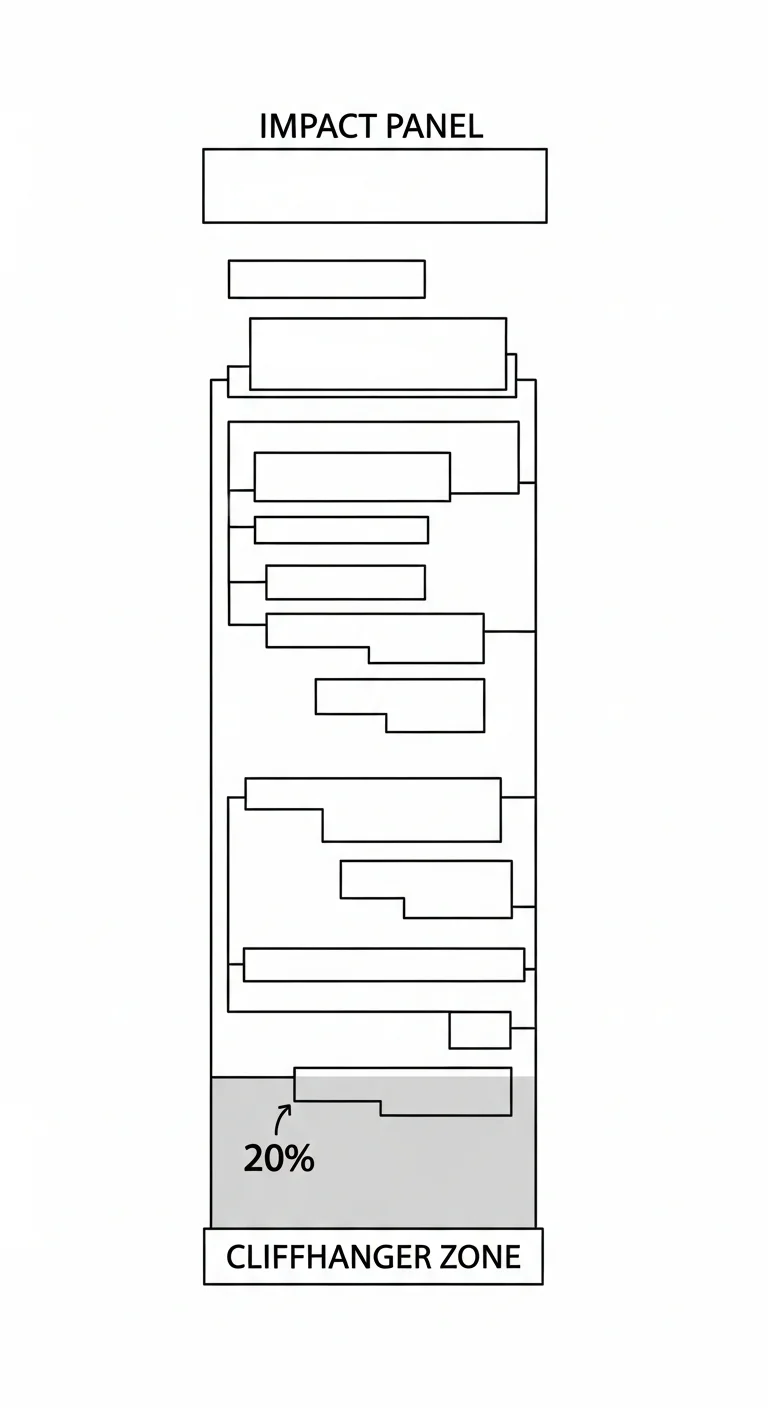
Where should I place cliffhangers?
The cardinal rule: the cliffhanger lives in the bottom 20% of canvas height, never higher. On an 8000px chapter, that means the reveal panel starts somewhere between 6400px and 7800px. Anything earlier and readers see the surprise without the commitment of a full scroll. Anything lower and you lose the breathing room that makes the reveal land.
Pair the placement with a 600-800px blank gutter immediately before the impact panel. That blank space is the “point of no return” — once a reader’s thumb has scrolled through emptiness, they are committed to seeing what comes next. The diagram below maps the zone exactly.
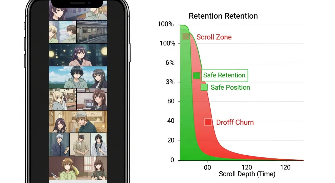
How does the retention curve predict drop-off?
The retention curve is an overlay on top of your scroll preview that estimates where readers are most likely to abandon a chapter. It draws on heuristics calibrated against drop-off patterns in popular webtoons — long dialogue blocks, repeated panel shapes, missing visual hooks at the fold, and pacing that flattens for too long.
Under the hood, the curve weighs roughly a dozen signals per scroll segment. The biggest weight goes to fold alignment: any 600-800px window without a visual hook earns a heavy penalty because that is the exact distance a reader’s thumb covers in one scroll motion. Dialogue density is the second biggest weight — three or more consecutive dialogue panels without a reaction panel triggers a yellow flag, and five in a row trigger red. Panel shape repetition gets a smaller weight but matters cumulatively: a chapter where every panel is the same width reads as monotone even when individual panels are well-drawn, and the curve flags clusters of identical aspect ratios. Color saturation flatness contributes too — long stretches of low-contrast tones lose readers because the eye has nothing to lock onto on a phone screen.
The training data is a sample of published webtoons paired with platform-shared retention curves where available, plus opt-in chapter analytics from creators using Comistitch’s publish layer. The model is deliberately simple — a weighted sum of feature scores — rather than a deep network, because creators need the flagging to be explainable. When the curve flags a segment, you can click through to see exactly which signals contributed: “5 consecutive dialogue panels”, “no visual hook in 1200px”, “panel widths within 5% of each other for 8 panels”. That transparency is the difference between a tool you trust and one you ignore.
Green segments are safe. Red segments are flagged for tightening, adding a visual hook, or moving dialogue elsewhere. The curve updates live as you edit, so the loop is fast: change a gutter, watch the red shrink, repeat. From inside the builder, you can click any flagged zone directly to jump to that panel and adjust it without losing your place. The recommended workflow is to make one change, glance at the curve, then move on — chasing a perfectly green curve usually over-tightens the chapter and removes the breathing room readers actually want. Aim for 80-90% green with intentional yellow zones around emotional rest beats.
This is where Comistitch’s pacing engine differs sharply from generic AI comic tools. Most stop at art generation. The retention curve closes the loop between draft and reader behavior before you ever publish.
Three pitfalls account for most of the red zones the curve flags, and recognizing them speeds up the edit loop. The first is dialogue clumping — five or six consecutive dialogue panels with no reaction beat between them. The reader’s eye has nothing to land on, the rhythm flatlines, and drop-off spikes. The fix is to break dialogue runs with a reaction panel every third or fourth beat: a close-up on the listener’s face, a hand gesture, an environmental cutaway. The engine flags clumps automatically and suggests reaction panel inserts, which you can accept with one click — the consistency engine handles the listener’s face from the locked fingerprint, so the insert reads as native to the chapter.
The second pitfall is uniform panel width. When every panel is the same width, vertical scroll feels mechanical even with strong art. Webtoons get their rhythm from width contrast — a wide establishing panel followed by three narrow stacked action panels, then back to a wide reaction. The engine measures width variance across the chapter and flags stretches where variance falls below a threshold. The fix is to widen one panel in three to canvas-edge, or narrow a stack to two-thirds width, breaking the visual loop.
The third pitfall is cliffhanger placement too early in the chapter — the reveal landing at the 60-70% scroll depth instead of the bottom 20%. Readers see the surprise without the commitment of a full scroll, then bounce because the chapter has nothing left to give. The fix is to reorder: move the reveal panel down, pad the gutter before it, and use the freed space for additional rising-action beats. The retention curve makes this misalignment obvious — a green segment near the bottom 20% means you have empty real estate in the highest-leverage zone of the chapter.
In short: Aim for 80-90% green on the retention curve. Three biggest red causes: dialogue clumping, uniform panel width, early cliffhanger placement.
Comparison: manual pacing vs AI pacing engine
| Dimension | Manual pacing | Comistitch pacing engine |
|---|---|---|
| Time per chapter | 4-6 hours | 15-25 minutes |
| Cliffhanger placement accuracy | Depends on creator instinct | Auto-locked to bottom 20% via tags |
| Drop-off detection | Only after publish (analytics) | Predicted before publish via retention curve |
The manual workflow is not wrong — veteran creators do it well. But for solo creators shipping weekly, the engine collapses the iteration loop from a full afternoon to a coffee break.
Try it now: pace a chapter in Comistitch
A concrete walkthrough for a 50-panel chapter:
Panels 1-10   → Hook beat. Action tags. 120px gutters. ~1500px tall.
Panels 11-30  → Rising action. Mixed tags. 150-250px gutters. ~3000px tall.
Panels 31-42  → Dialogue + reaction. 250-300px gutters. ~2500px tall.
Panels 43-48  → Impact ramp. 400px gutters. ~1200px tall.
Panel 49      → 800px blank gutter. (point of no return)
Panel 50      → Full-width cliffhanger panel. ~800px tall.
Total canvas  → ~9000px. Cliffhanger lands at 91% scroll depth.
That layout drops you neatly inside the optimal length window with the cliffhanger anchored where retention math wants it. For the upstream step — turning your written script into a paneled draft before you start tagging — start with turn story into comic with AI.
What’s next? Publish your webtoon chapter
Once your retention curve looks clean and the cliffhanger is locked, the chapter is ready to leave the builder. Two adjacent pieces tie into this workflow: webtoon character consistency with AI 2026 keeps your cast on-model across the long scroll, and publish webtoon on Webtoons and Tapas platforms covers the export specs each host expects.
Pacing is the layer most webtoon creators underestimate and the one that quietly separates “nice art” from “I have to read the next chapter.” Tag honestly, trust the gutters, place the cliffhanger low, watch the retention curve. Then ship.
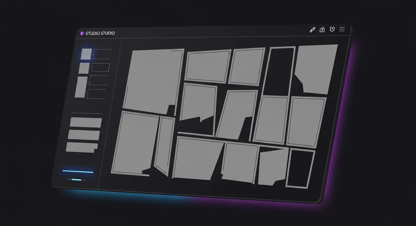
Ready to feel the difference? Open the Studio and pace a chapter in 15 minutes.
Related read: Healing iyashikei pacing is a different art — read the guide.