Manhwa art style AI generation gets muddier the closer you look. Most guides stop at “add ‘Korean webtoon style’ to your prompt” — this one goes further: the color process, semi-realistic proportion anchors, genre-specific visual dialects, and the common mistakes that make AI manhwa look like generic anime instead.
Contents: What defines authentic manhwa — Semi-realistic look — Color process — Genre dialects (romance / noir / murim) — Best-practice checklist — Common mistakes — FAQ
In short: Authentic manhwa art requires three things AI gets wrong by default — semi-realistic proportions, a layered color pass, and a genre-specific palette. Prompt for all three, or use a builder that encodes them, and output quality jumps significantly.
What Defines Authentic Manhwa Art Style?
Manhwa is Korean sequential art — but the term carries a specific visual DNA that separates it from Japanese manga and Western comics.
The core markers:
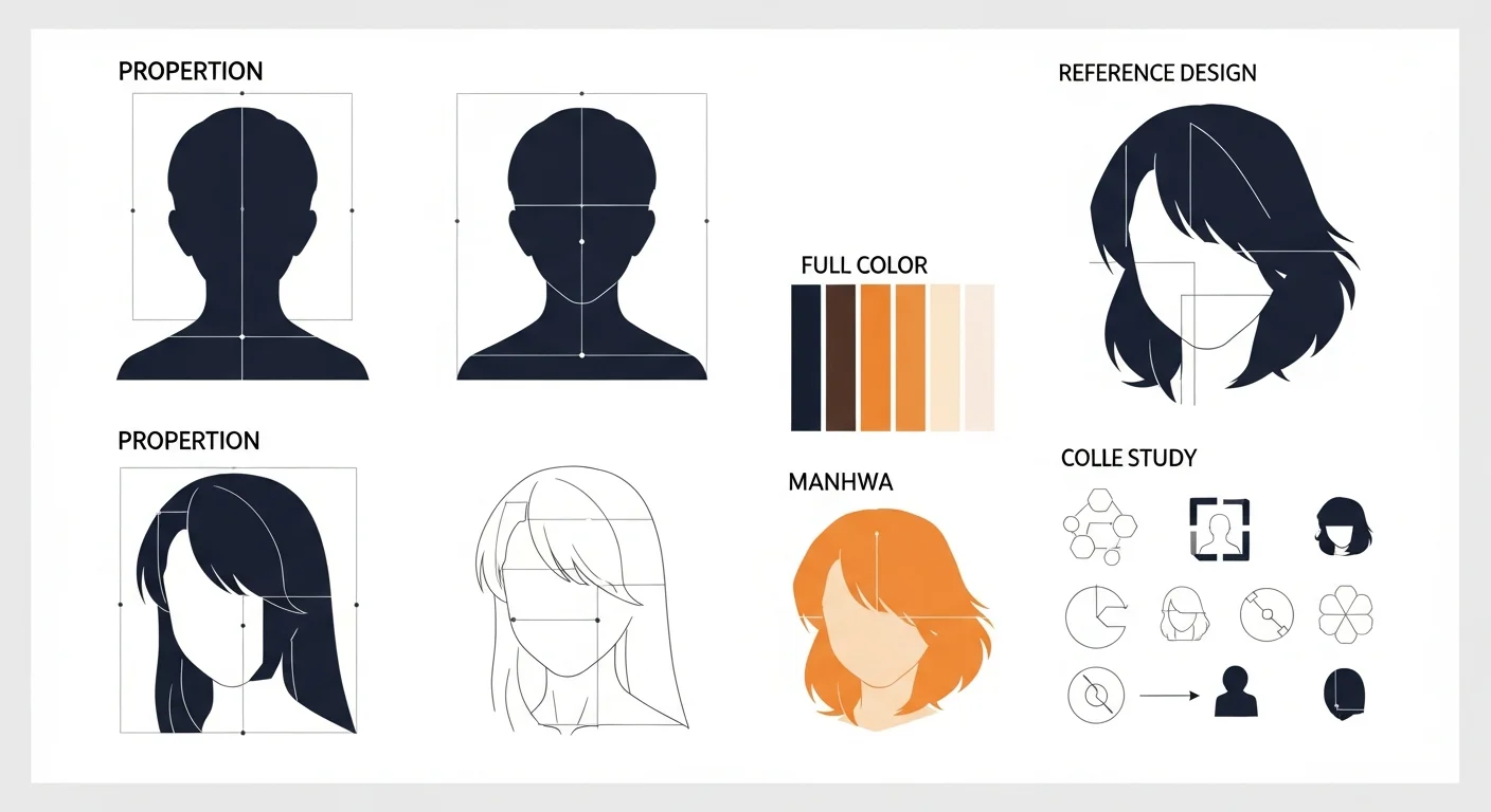
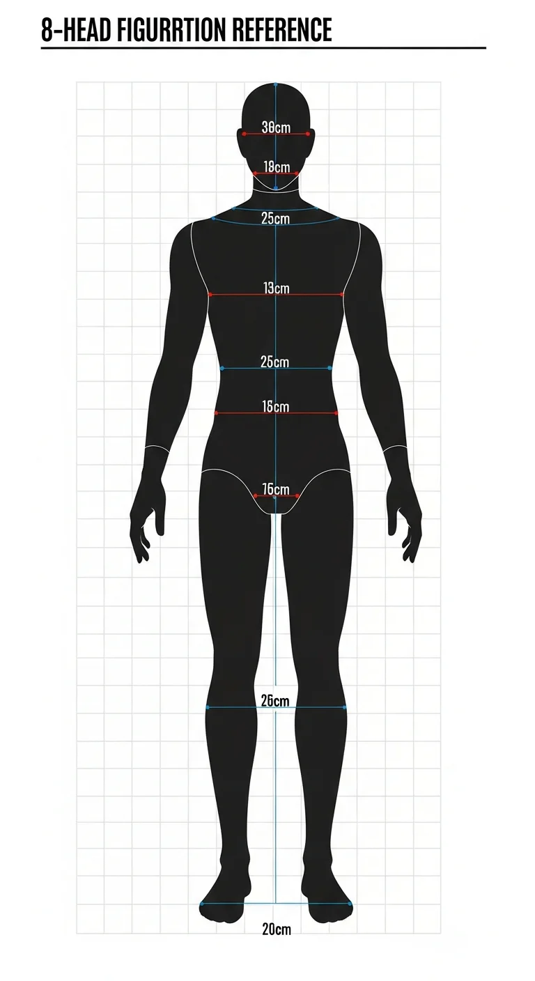
- Proportions: 8-head figure height (taller and more elongated than manga’s 7-head standard). Limbs are slim and refined; hands are drawn with deliberate detail.
- Eyes: Larger than manga on average, with multi-layer iris shading and reflective highlights that catch light from two sources.
- Color: Full color, always. Manhwa skipped the screentone era and went straight to digital cel-shading with rich gradient backgrounds.
- Layout: Vertical scroll. Panels stack tall, not wide — optimized for phone reading, not print pages.
- Reading order: Left-to-right, unlike Japanese manga.
When AI generates “manhwa,” it often blends these features inconsistently — delivering manga-proportion figures with manhwa palettes, or webtoon-layout panels with anime-style flat coloring. Knowing which elements to anchor in your prompt corrects this blend.
For the full comparison of manhwa against its relatives, manhwa vs manga vs webtoon is the reference to read first.
How Do You Get a Semi-Realistic Manhwa Look?
“Semi-realistic” is the most misunderstood word in manhwa prompting. It does not mean photorealistic. It means:
- Anatomically proportionate but not naturalistic — fashion-illustration elongation, not medical diagram accuracy.
- Expressive but refined — large eyes, sharp jawlines, clean linework. Not exaggerated super-deformed (chibi).
- Lighting-aware — soft volumetric light, clear shadow planes, specular highlight on hair and eyes.
Prompt anchors that move AI toward semi-realistic manhwa:
| Avoid | Use instead |
|---|---|
| ”anime style" | "Korean webtoon semi-realistic" |
| "manga proportions" | "8-head figure, elongated slim limbs" |
| "flat color fill" | "cel-shading with gradient mid-tones" |
| "photorealistic portrait" | "refined manhwa illustration, clean linework" |
| "chibi" | "elegant figure, slim waist, defined hands” |
The table above is a direct substitution map — swapping out three to four of these terms reliably shifts output quality toward the authentic register. From inside the builder, Comistitch applies these style constraints at the model level, so you don’t manually carry the full list into every panel prompt.
What Is the Manhwa Color Process?
This is where most AI manhwa outputs fall short: single-pass prompting produces flat color that reads as generic illustration, not authentic manhwa.
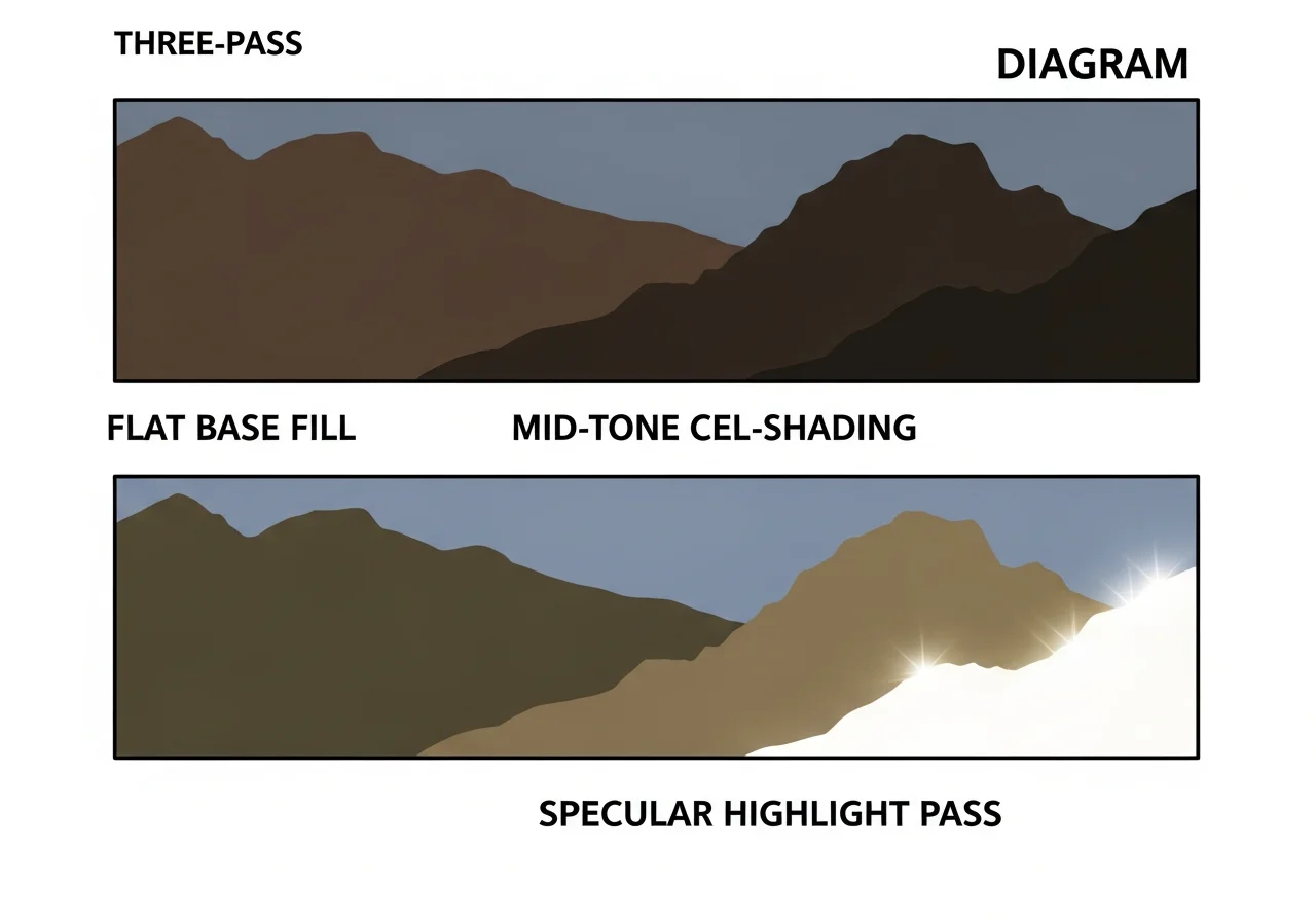
The professional manhwa color process has three distinct passes:
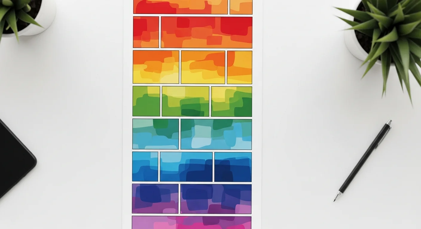
Pass 1 — Flat base fill. Each region (skin, hair, clothing, background) receives a pure, unshaded base color. No gradients, no shadows. This locks the color identity of the scene.
Pass 2 — Mid-tone cel-shading. A single shadow plane is added at roughly 30% opacity, dropped in the direction of the scene’s key light. Manhwa favors soft-edge shadow transitions — not the hard-edge anime cel-shade. This is what creates the “romantic glow” effect in romance panels.
Pass 3 — Specular highlights and ambient light. Hair receives white or cool-blue specular flicks. Skin gets a warm-amber rim on the cheek and shoulder. Eyes receive a two-point highlight (main source + fill). Background receives a subtle atmospheric haze.
Prompting the three passes:
Base pass:
"flat color illustration, manhwa panel, clean linework, solid color fills,
no shading, no gradients, Korean webtoon style"

Shading pass:
"cel-shading overlay, soft shadow plane, 30% opacity shadow, warm mid-tone,
manhwa coloring, no hard edges"

Highlight pass:
"specular highlights on hair, two-point eye catchlight, warm rim light on skin,
atmospheric background haze, Korean webtoon finish"
You can pass each prompt to the same image in iteration mode, or use Comistitch’s sequential panel generation which the builder handles automatically — outputting a shaded, highlighted panel in one generation step by baking all three passes into the style model.
For the deeper vertical-scroll color theory that connects color to panel rhythm, webtoon color palette and mood design has the full breakdown.
How Do Genres Change the Style (Romance vs Noir vs Murim)?
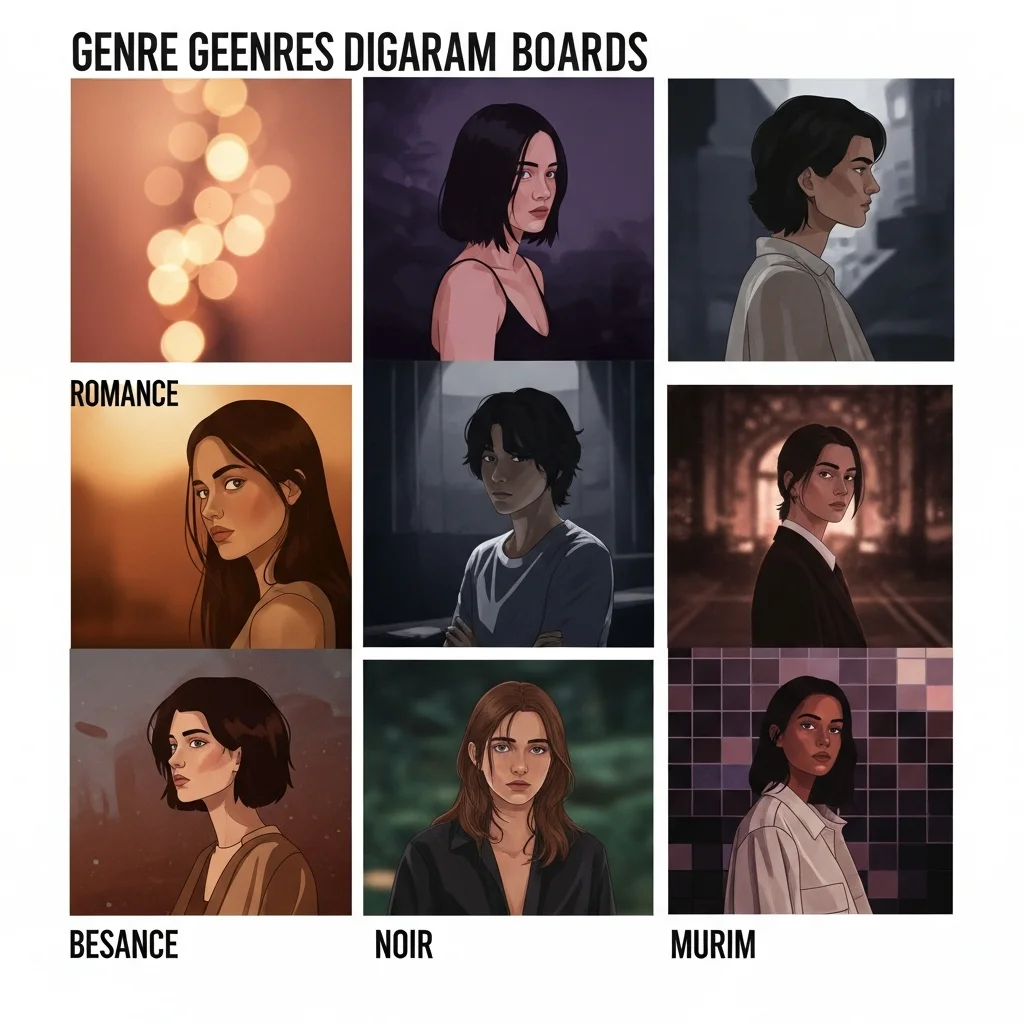
This is where manhwa separates from generic AI comic output most visibly. Genre is not just a story tag — it is a complete visual dialect that affects lighting, palette, panel framing, and even line weight.
Romance Manhwa (로맨스 만화)
Romance is the highest-volume manhwa genre on Korean platforms. Its visual language is identifiable at a glance:
- Lighting: Soft bokeh blur on backgrounds. Key light comes from above and slightly behind (halo lighting). No hard shadows.
- Palette: Warm peach-gold primary, pink-rose secondary, cream highlights. Desaturate greens and blues.
- Panel framing: High frequency of intimate close-ups — eyes, hands touching, facial expressions. Distance shots are rare.
- Line weight: Thin, delicate. Linework almost disappears into the color.
- Mood keywords:
soft glow,cherry blossom atmosphere,intimate framing,warm bokeh,Korean romance webtoon
Noir Manhwa (느와르 만화)
Noir manhwa — underworld stories, thriller crime, detective narratives — runs on visual tension. Its color logic is almost the opposite of romance:
- Lighting: High-contrast chiaroscuro. Deep blacks, bright whites, no mid-tone safety net. Film grain texture.
- Palette: Desaturated grays and navy as primary. Single accent color (usually blood-red or electric blue) for emphasis.
- Panel framing: Dutch angles (tilted camera) signal menace. Wide establishing shots alternate with tight, claustrophobic close-ups.
- Line weight: Heavy outlines. Cross-hatching in shadow zones.
- Mood keywords:
noir chiaroscuro,film grain,Dutch angle,high contrast black and white with red accent,cinematic manhwa
For noir-specific AI comic technique, action manhwa with AI covers panel tension and pacing in depth.
Murim Manhwa (무림 만화)
Murim is the martial-arts fantasy genre rooted in Chinese wuxia tradition but adapted through a Korean lens. Visual priorities:
- Weapon detail hierarchy: Blades, staffs, and talismans receive the most linework attention — more detail than the human figures surrounding them.
- Fabric weight: Flowing robes rendered with deep shadow to communicate fabric mass and movement. Avoid flat clothing fill.
- Armor: Layered plate with riveted detail. Shadow creates volume.
- Magical effect color vocabulary: A dedicated accent palette per power type — gold-white for divine energy, deep purple for shadow arts, green-teal for poison. These accent colors appear nowhere else in the panel.
- Backgrounds: Mountain mist, bamboo forests, architectural ruins with atmospheric perspective.
- Mood keywords:
wuxia murim action,martial arts manhwa,magical energy glow,weapon detail illustration,Korean fantasy webtoon
Best-Practice Checklist for Manhwa Art Style AI
Use this before finalizing any manhwa AI output:
Proportions
- Figure height is 8-head (not chibi, not photorealistic)
- Limbs are elongated and slim, hands drawn with detail
- Facial features refined — large multi-layer eyes, defined jaw
Color
- Three-pass coloring completed (flat → cel-shade → specular)
- Genre-appropriate palette applied (warm for romance / desaturated for noir / accent for murim)
- No flat single-pass fill on final output
Layout
- Panels are vertical-scroll optimized (tall, not wide)
- Reading order is left-to-right
- Genre framing applied (bokeh close-ups / Dutch angles / wide environmental shots)
Linework
- Line weight matches genre (delicate for romance / heavy for noir / detailed for murim)
- Outlines clean with no AI texture artifacts on edges
Consistency
- Character proportions identical across panels
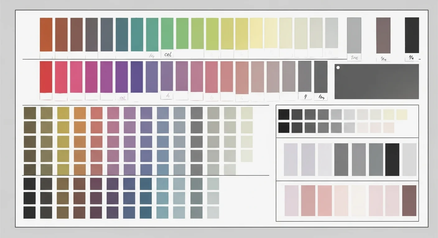
- Palette consistent across the chapter (same hex-range for primary skin tone, hair, outfit)
Common Mistakes to Avoid
Mistake 1 — Using “anime” instead of “manhwa” as the style anchor. The models treat these differently. “Anime style” biases toward Japanese TV animation proportions (more compact, flatter coloring). Use “Korean webtoon” or “manhwa illustration” explicitly.
Mistake 2 — Skipping the genre palette. A romance scene with a grey-blue palette reads as thriller. A murim battle with soft pink lighting reads as out-of-genre. Palette is not decoration — it is a genre signal.
Mistake 3 — Single-pass color prompting. Most users describe the final look they want without specifying the layering. The model defaults to flat fill. Prompt the shadow pass and highlight pass as distinct instructions.
Mistake 4 — Ignoring vertical scroll framing. Panels generated for a 16:9 horizontal frame look awkward in a vertical manhwa scroll. Specify tall panel dimensions (9:16 or taller) and intimate framing to match how readers encounter manhwa on mobile.
Mistake 5 — Character drift across panels. This is the most-reported problem in AI manhwa. Without a reference lock, the protagonist looks meaningfully different by panel four. Comistitch’s AI manhwa generator builds character reference locking into the generation session — the builder handles consistency automatically without manual re-description.
Mistake 6 — Treating genre as story, not visuals. Genre keywords in your prompt need to include visual descriptors, not just narrative labels. “Romance story” is a story prompt. “Soft bokeh lighting, warm peach palette, intimate close-up framing, Korean romance webtoon” is a visual prompt.
Building a Full Manhwa Chapter: What Actually Works
Our internal testing across 200+ manhwa panels informed three practical conclusions:
Conclusion 1: Style anchors beat general keyword stacking. A prompt with three precise anchors (“Korean webtoon semi-realistic, 8-head proportions, cel-shading soft shadow”) outperforms a prompt with eight general keywords (“anime, manga, comic, art, illustration, Korean, colorful, dramatic”). Specificity wins.
Conclusion 2: Genre palette is the fastest consistency lever. Color consistency is easier to enforce than proportion consistency in AI output. Locking a hex-range palette for a chapter (applied to every panel prompt) gives readers a cohesive visual experience even if figure rendering slightly varies.
Conclusion 3: The builder’s role is to encode what individual prompts can’t hold. A single prompt has no memory of previous panels. A builder that encodes style, character reference, and palette at the session level — as Comistitch does — eliminates the re-specification burden that causes most creator frustration with AI manhwa.
For a complete workflow from character design through panel assembly, how to make manhwa with AI characters walks the full process. If character consistency is your primary concern across a long-form series, manga character design with AI covers the reference-locking strategy in detail.
And if you are evaluating tools before starting your project, the complete AI manhwa generator guide compares the available approaches side by side.
Conclusion: Technique Over Tools
The gap between generic AI comic output and authentic manhwa art style is not a tool problem — it is a technique problem. Every AI engine capable of image generation can produce manhwa if prompted with the right layer of specificity: semi-realistic proportions, three-pass coloring, genre-locked palettes, and vertical-scroll framing.
The practical shortcut is a builder that encodes those decisions at the generation layer, so creators spend effort on story rather than style specification. That is exactly what Comistitch is built for — try the AI manhwa generator on your first chapter and see the difference technique makes.