Manga shading with AI applies screentones — repeating dot, line, and texture patterns — to black-and-white panels in seconds. Comistitch’s tone mapping engine reads mood tags from your script and picks the right tone density: dark dots for action, soft gradients for romance, noisy textures for horror. A 6-panel page renders in under a minute, and you keep full per-panel override control for the moments that matter most.
In short: Tag panels by mood, hit “Apply Tones”, and ship pro-grade screentoned manga in 15 minutes per page. The AI maps mood to tone density automatically.
What are manga screentones and how do they work?
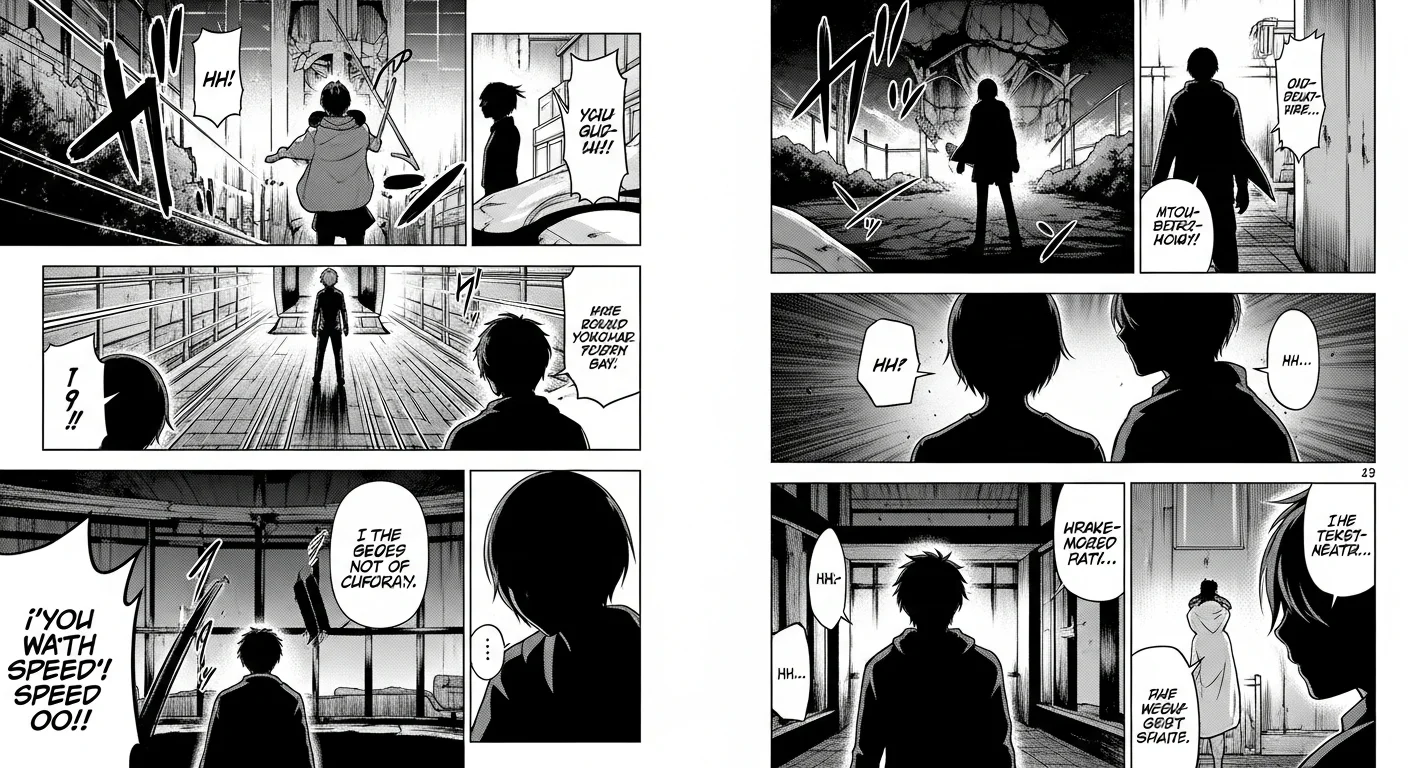
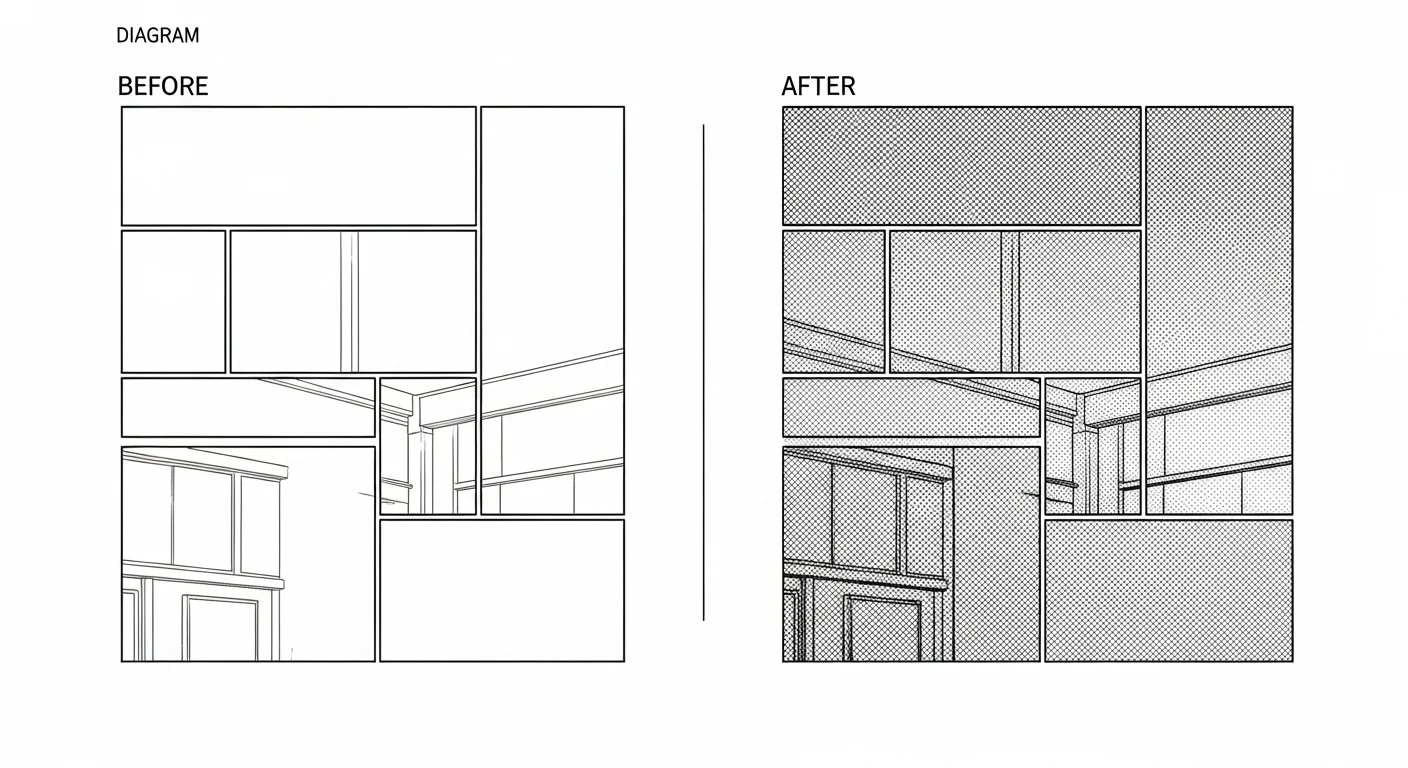
Screentones are the secret sauce of black-and-white manga. They are repeating patterns — dots, lines, gradients, textures — applied to flat artwork to create the illusion of mid-tones, mood, and depth without using any color. Originally sold as adhesive sheets in Japan (called “tone” or “skin” sheets), they let artists shade entire pages by cutting and burnishing pattern paper onto inked line art.
The trick is density. A 10% dot tone reads as a soft grey; a 60% dot tone reads as a dark, almost ominous fill. Stack two tones at slightly different angles and you get layered depth. Combine dot tones with hatching and you get clothing texture, sky atmosphere, and skin shadow — all in pure black ink. If you want to see screentone aesthetics applied to character art end-to-end, the AI manga generator page walks through full-style examples.
AI changes the math. Instead of cutting paper or hand-drawing thousands of dots, the tone mapping engine reads your script, picks a density, and applies it. What used to take an hour now takes a minute.
How does the 5-level tone hierarchy work?
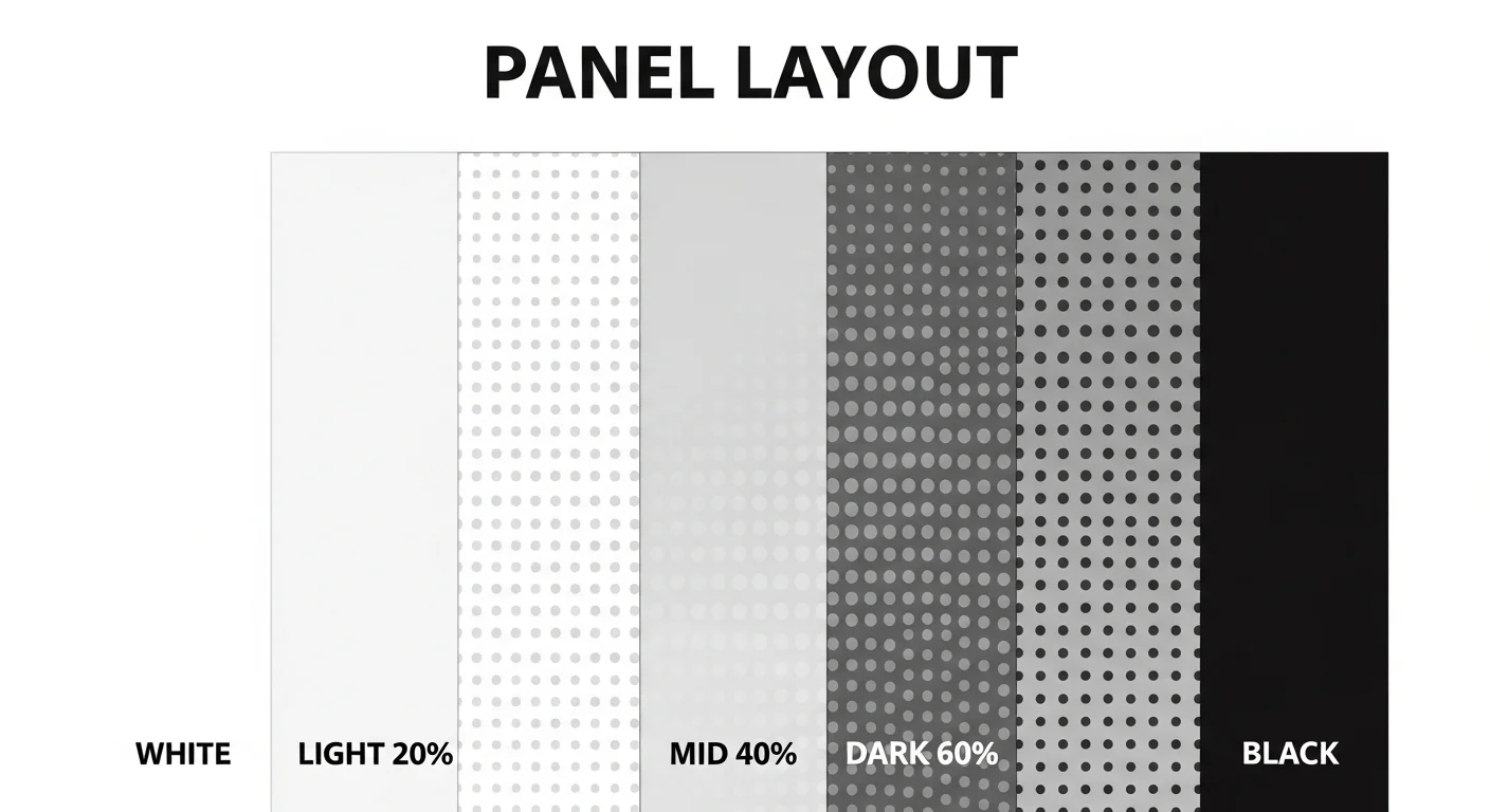
Almost every published manga page lives inside a 5-level tone hierarchy. Master it once and you understand 90% of professional shading.
- Pure white — highlights, paper white, focal points. Used for skin, eye sparkles, and the brightest cloth folds.
- Light tone (10-20% dot) — soft shading, daytime ambient, gentle skin shadow. Reads as airy and calm.
- Mid tone (40% dot) — clothing fills, secondary characters, warm interiors. The workhorse density.
- Dark tone (60-70% dot) — heavy shadow, night exteriors, dramatic mood. Used sparingly to anchor the eye.
- Pure black — silhouettes, deep shadow, hair, and emotional weight. The “off switch” of the tone scale.
Comistitch’s auto-shader assigns each region of every panel one of these five values. The result is consistent depth across the page: no two adjacent regions blur into one another, and every panel has a clear focal point. From inside the builder, you can override any region to push it lighter or darker without touching the rest.
How does AI map mood to screentone style?
Density alone is not enough. A romance scene shaded with the same patterns as an action scene reads as flat. The tone mapping engine fixes this by reading the mood tag on each panel and swapping pattern style, not just density.
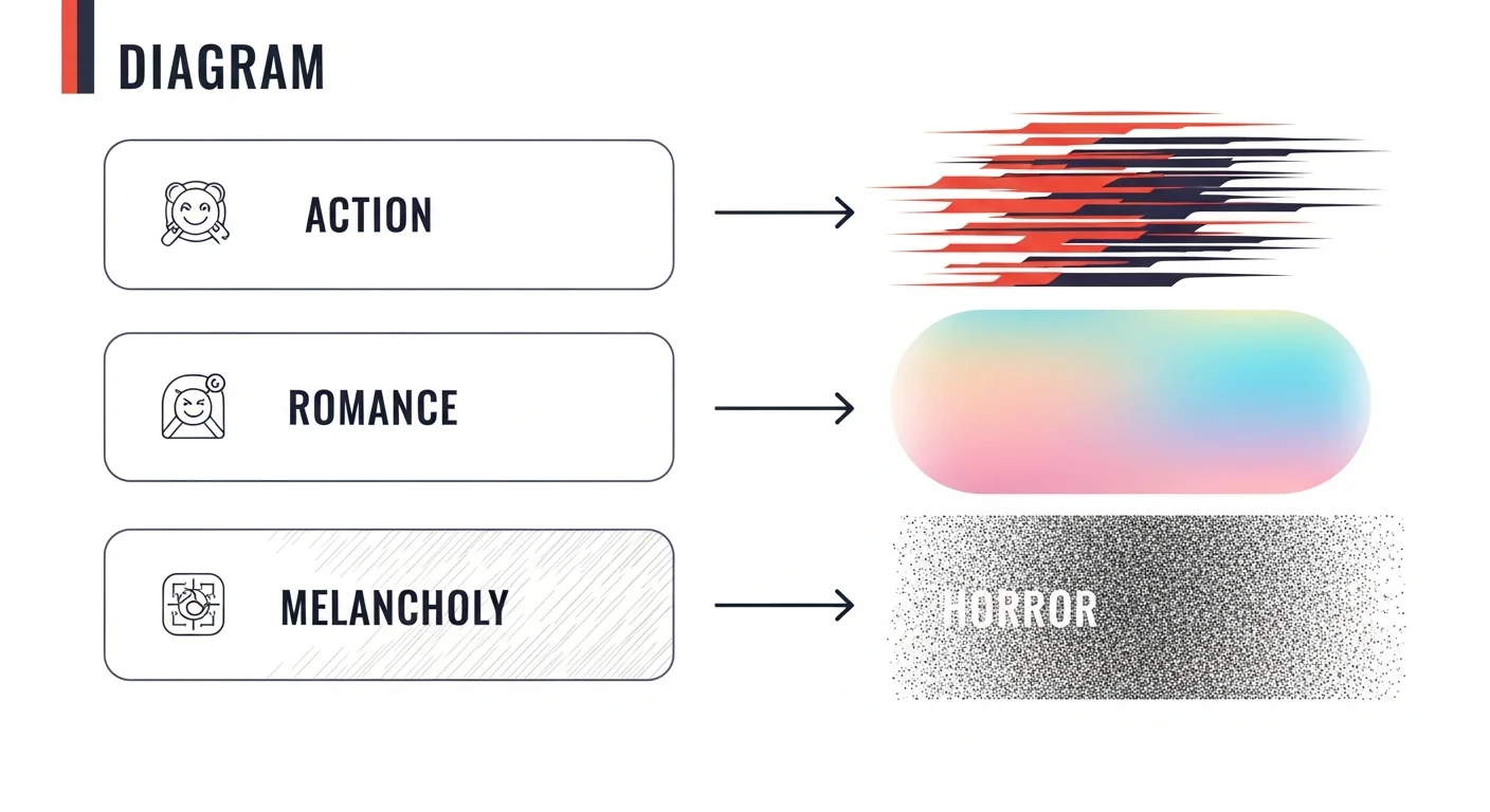
| Mood tag | Pattern style | What it conveys |
|---|---|---|
| Action | Speed-line tones, hard dot edges | Motion, urgency, impact |
| Romance | Soft gradient tones, sparkle overlays | Tenderness, warmth, daydream |
| Horror | Noise textures, irregular hatching | Dread, unease, instability |
| Melancholy | Light hatching, faded gradients | Quiet sadness, memory, distance |
You don’t need to memorize which pattern goes with which mood. Tag the panel “action” and the engine picks speed lines automatically. Tag “horror” and you get jittery noise tones. Tag combinations work too — “action + horror” produces dark, fast, noisy panels suited for chase scenes in a thriller.
What does Comistitch’s screentone library offer?
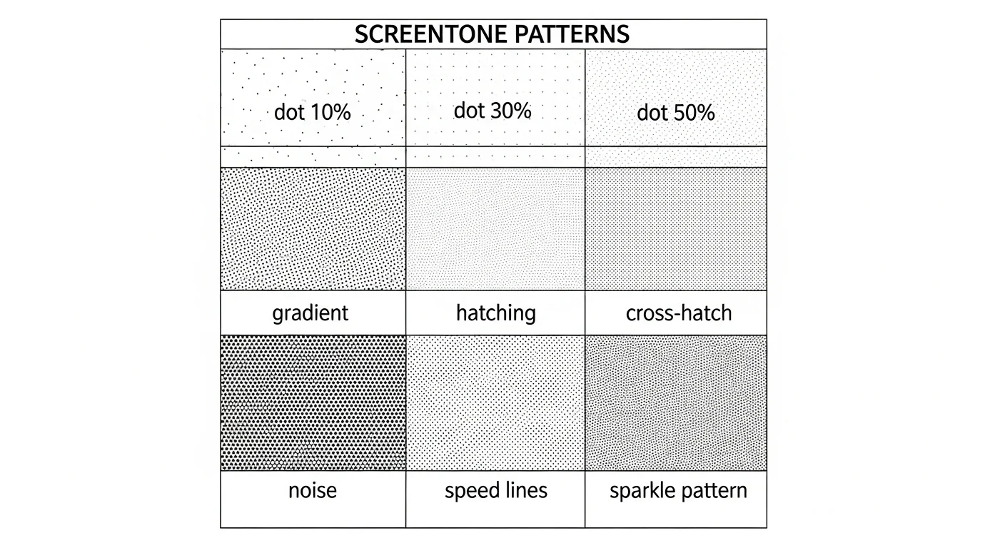
The Comistitch screentone library ships with 200+ professional patterns organized by family: solid dot densities (10%, 20%, 30%, 40%, 50%, 60%, 70%), linear gradients, radial gradients, hatching, cross-hatching, noise grains, speed lines (radial and parallel), sparkle patterns, and decorative motifs (flowers, bubbles, rain).
Each pattern is vector-based, so it scales cleanly from a 1080w digital export up to a 600 DPI print PDF without aliasing. The library is searchable by tag — try “rain”, “explosion”, “dream”, “office” — and you can favorite patterns for one-click reuse across an entire chapter.
If you are new to the builder, the Studio overview explains the panel canvas, character library, and export pipeline. The screentone library lives in the right sidebar once you open any page.
How do I override AI tone choices per panel?
Auto-shading covers the bulk of the work, but every page has at least one or two panels that deserve manual love. The override flow is built for that.
Click any panel. The screentone library slides open. Drag a pattern onto a specific zone — background, character clothes, sky, props — and it snaps to fit the masked region. Adjust opacity from 25% to 100%. Rotate the pattern angle in 5-degree increments to avoid moiré clashes with adjacent panels. Use the eraser to lift tone from focal areas like the protagonist’s eyes, where pure white reads as emotional emphasis.
The same override panel handles overlays: speed lines, impact bursts, motion lines, sparkles, rain, and snow. You can also import custom patterns as PNG and the builder vectorizes them on upload.
If you are working on a stylized non-manga look — say cyberpunk neon or vintage halftone — the techniques cross over. The cyberpunk comic style guide covers neon-tone overrides and chromatic aberration overlays that pair well with screentone discipline.
Comparison: AI shading vs traditional screentones
The gap between manual screentone work and AI shading is bigger than most newcomers realize. Here is the honest tally.
| Dimension | Traditional screentones | AI shading | Comistitch advantage |
|---|---|---|---|
| Time per page | 1-2 hours | 30-60 seconds + 15 min review | ~6x faster total turnaround |
| Skill required | High — pattern matching, knife work, tone theory | Low — tag mood, click apply | Beginners ship pro pages on day one |
| Print quality | Risk of moiré at high DPI, manual tone adjustment | Vector tones, automatic moiré prevention | Print-ready CMYK PDF in one click |
| Iteration cost | Restart panel from scratch | Re-tag mood, re-apply | Free experimentation per panel |
The traditional method still wins on one thing: tactile feel. Cutting paper and burnishing it onto bristol board is a craft, and some artists prize it. But for any creator shipping monthly chapters, AI shading is the only realistic path to consistent quality at volume.
Try it now: shade a page in Comistitch
Here is the minimum-viable workflow. Open Comistitch Studio, paste your script, and run this checklist:
1. Open page → click "Auto-panel" if not already paneled
2. For each panel, click and assign a mood tag:
   - action / dialogue / romance / horror / melancholy / impact
3. Hit "Apply Tones" — wait 30-60 seconds
4. Review each panel; click any one to open the screentone library
5. Drag override patterns onto background or clothing zones
6. Erase tone from focal eyes/highlights for emphasis
7. Export → PNG (digital) or PDF (print)
That is the whole loop. Three minutes of tagging, one minute of generation, ten minutes of polish, one minute of export. From inside the builder, every step has hover-tooltips so you do not need to memorize anything.
What’s next? Finalize and publish your manga
Shading is the last visual layer before publication. Once your page is toned, you have a print-ready asset. The natural next steps:
- Loop back to the pillar guide on manga paneling if any panels feel cramped or visually unbalanced — paneling and shading interact, and a tone-heavy panel can need extra breathing room.
- Read publish your AI manga from script to page to walk through the export, cover, and chapter-listing flow on the Comistitch creator profile.
- Revisit manga character design if your character outfits read flat after shading — outfit complexity drives tone variety, and a richer wardrobe gives the screentone engine more to work with.
When you are ready to ship, jump straight into Comistitch Studio and start a new manga page. The free tier gives you full screentone library access and three pages per week, which is plenty to learn the rhythm before upgrading.
Tone mapping turns shading from a craft bottleneck into a tagging exercise. Tag your moods, trust the 5-level tone hierarchy, override the panels that deserve a personal touch, and your pages will feel like they came out of a studio with ten assistants — because in a way, they did.
Related read: For dark-ink horror manga in the Junji Ito tradition.