Updated May 2026 — Psychological horror in the black ink manga tradition is one of the hardest genres to execute well and one of the easiest for AI to ruin. This guide covers the exact craft elements — negative space, dread pacing, ink contrast, scale violation — that make the genre work, then shows how to direct an AI builder to reproduce them without recycling clichés.
In short: Great horror manga is built on what you withhold, not what you show. Master negative space, tonal contrast, and slow panel pacing — then use the AI builder to lock those parameters in every sequence.
What Is the Psychological Horror Manga Tradition?
Before touching any AI tool, you need to understand the visual grammar that defines this genre. Horror manga rooted in the psychological ink tradition shares a set of structural signatures that have nothing to do with specific characters or stories:
- Ink-first rendering — the page reads in pure black and white, with mid-tones delivered through screentone density rather than gray wash. The ink line is the unit of horror.
- Negative space as an active element — blank page area is not emptiness; it is pressure. A disturbing object centered in 70% white page feels more claustrophobic than the same object surrounded by detail.
- Anatomical wrongness over gore — the most effective body horror in this tradition describes something slightly, specifically wrong: proportions that fail quietly, details that accumulate beyond the point of reason. Gore is a shortcut that numbs; wrongness escalates.
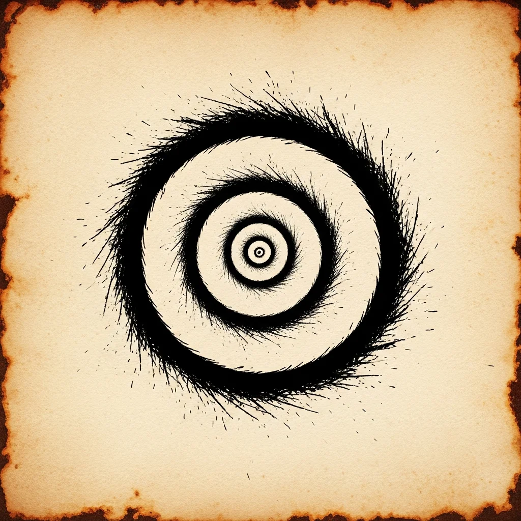
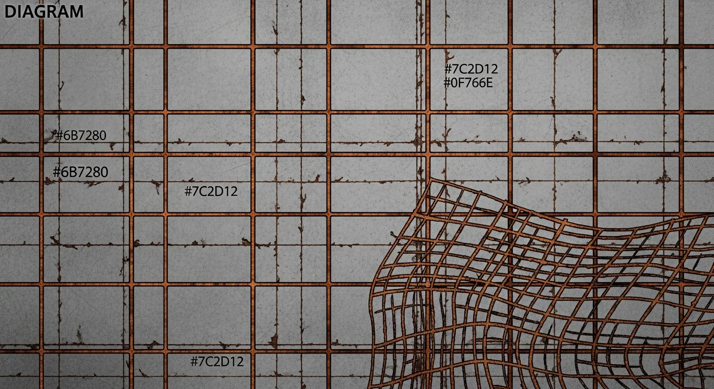
- Motif obsession — a single image (spiral, eye, mesh, flood) appears across multiple panels and gradually warps, growing, multiplying, or inverting. Repetition with drift is the engine of long-form dread.
Understanding this grammar lets you prompt deliberately, rather than typing “horror manga” and hoping for the best. Comistitch’s dedicated AI horror comic style page documents the exact ink presets and screentone defaults the platform applies when you select the horror genre.
How Does the Junji Ito Tradition Use Negative Space to Create Horror?
The key technique in this visual lineage is the isolation principle: the more space surrounds the wrong thing, the wronger it becomes. This is counter-intuitive. Most illustrators pack detail to show craft. Psychological horror manga strips detail away.
Here is the mechanism panel by panel:
- Establish — wide shot, normal environment, heavy detail everywhere. Reader feels oriented.
- Interrupt — medium shot, detail stripped out. One element is wrong. No explanation.
- Isolate — close-up, or even a fragment. The wrong element fills the center. White space fills the rest. Reader cannot look away.
- Accumulate — return to wide shot. But now the wrong element has spread. The negative space that was safe is no longer safe.
This four-beat rhythm works at the page level and at the chapter level. The goal is to make negative space feel contaminated by what it surrounds — not empty, but watched.
When prompting an AI builder for this effect: specify ink weight on the subject separate from ink weight on the environment. Heavy fill on the disturbing element, open space elsewhere, is a prompt instruction, not a style label.
Can AI Generate Psychological Body Horror as Effectively as Hand-Drawn Manga?
Not automatically — but with deliberate direction, yes. The distinction matters.
AI generators default to what the training distribution rewards: completeness, symmetry, legibility. Psychological horror manga works by breaking all three. You must counteract the defaults.
What AI does well:
- Consistent ink style across a sequence (once you lock the style token)
- Screentone application at specific density levels
- Background environment generation — decaying interiors, flooded corridors, fog-covered exteriors
- Scale relationships when prompted explicitly (“subject twice as tall as doorframe”)
What AI requires explicit instruction for:
- Anatomical wrongness (you must describe it specifically — see dread device table below)
- Negative space preservation (specify “70% of panel is white — do not fill”)
- Motif consistency across panels (lock the motif in the style reference or in repeated prompt fragments)
- Ink weight differentiation between focal element and background
Comistitch’s panel canvas ships with a horror style preset that pre-loads a high-contrast ink pass and mood-matched screentone library — from inside the builder, the dread tone level slider controls screentone density per panel independently, which is the main technical lever for the four-beat isolation rhythm described above.
For a broader comparison of AI tools and their genre-handling strengths, the best AI manga generators 2026 roundup covers ink rendering quality across platforms.
Horror Manga Dread Device Cheatsheet
Use this table when building your panel prompts. Each device maps to a prompt fragment you can paste directly into the builder.
| Dread Device | What It Does | Prompt Fragment Example |
|---|---|---|
| Negative space | Isolates the wrong thing, implicates the empty area | "subject center frame, 65% panel area open white, no background fill" |
| Ink contrast spike | Heavy black fill on subject vs. open background — eye goes where ink is heaviest | "deep black fill on subject, screentone 10% max on surrounding area, high contrast" |
| Repetition with drift | Motif reappears panel to panel, slightly changed each time | "[motif] appears in panel corner, slightly larger than previous panel, same orientation" |
| Scale violation | Object is the wrong size for its context — triggers wrongness without naming it | "figure occupies 80% of doorframe height, door visually too small, environment scale inconsistent" |
| Anatomical accumulation | One wrong detail, then two, then too many to track | "arm joint bends one degree past normal, fingers one count too many in shadow" |
| Environmental contamination | The safe background starts to show the motif | "wallpaper pattern begins resolving into [motif] in upper right corner, partially" |
What’s the Difference Between AI and Hand-Drawn Horror Manga Aesthetics?
The honest answer: the output gap is in ink line quality and anatomical drift control, not in composition or screentones.
Composition and pacing — AI handles these competently when prompted with explicit panel beat instructions. A 6-panel isolation sequence built in Comistitch with mood tags reads comparably to a hand-drafted storyboard at the thumbnail stage.
Screentones — AI-applied screentones at locked density levels are indistinguishable from hand-applied tones on a digital tablet. This is the easiest gap to close.
Ink lines — AI ink lines tend toward smoothness and regularity. Hand-drawn horror ink often has deliberate tremor, variable weight, and overdrawn hatching that communicates anxiety through the line itself. You can partially compensate by prompting for “rough ink edges” or “variable line weight,” but this remains the clearest tell.
Anatomical specificity — hand-drawn horror artists know exactly which joint to extend one degree past normal. AI anatomy wrong-ness requires explicit description. The more specific your prompt, the closer you get.
Practical workflow: use AI for composition, environment, screentone, and panel pacing — the structural elements. Reserve manual ink overlay for the disturbing focal element if line anxiety is important to the piece.
For the screentone side of this workflow, the manga shading and screentones with AI guide covers the five-tone hierarchy and mood mapping in full.
What Are Best Practices for AI Panel Pacing in Horror Manga?
Panel pacing in horror manga is slower than in action manga and differently slow than in slice-of-life. The rhythm is: expand — compress — isolate — let silence linger.
Expand — open panels (landscape, establishing, wide shots) tell the reader the space is normal. Give them room.
Compress — as the wrongness approaches, panels narrow. Vertical stacks of narrow panels accelerate heartbeat. Diagonal panel breaks imply instability in the world itself.
Isolate — the reveal panel should be the largest on the page, or the smallest isolated panel surrounded by white margin. Both work; choose based on whether the wrongness is vast (large panel) or intimate (tiny isolated fragment).
Let silence linger — a page with only two panels and 60% white margin is not wasted page. It is atmosphere. Most AI tools will auto-fill panels to 6 per page; override this in horror sequences and drop to 2-3.
In Comistitch Studio, the panel layout editor lets you drag panels to custom sizes and positions, and the builder handles re-composition automatically when you resize. Set the dread flag on these open panels and the screentone pass drops to near-zero fill — preserving the silence.
The manga paneling 101 guide covers reading-order grids and emotional weight sizing in detail — the horror pacing layer sits on top of those same fundamentals.
For pacing rhythm that carries across multiple pages — including cliffhanger placement — webtoon pacing and cliffhanger techniques applies directly to long-form horror chapters.
Avoiding AI-Slop in Dread Scenes — Prompt Patterns That Work
“AI-slop” in horror means: generic monsters, symmetrical faces of fear, explosion-of-tentacles compositions, and neon-lit gore that looks more like a video game HUD than a horror manga panel. These outputs happen when the prompt is low-specificity.
The fix is precision at the wrong level, not at the correct level. Horror works by breaking one rule precisely, not by introducing universal chaos.
Prompt anti-patterns to avoid:
- “scary monster attacking person” — generic, activates action-movie dataset
- “disturbing body horror creature” — produces stock creature renders
- “horror atmosphere dark” — activates generic dark-fantasy lighting
Prompt patterns that work:
Panel description: Interior room, single door centered. Long wooden dining table, correct
proportions. Eight chairs around the table. On second look: nine chairs. Count again:
eleven chairs. The room has not changed in size. Heavy ink fill on chair legs. Negative
space above table clean white. Screentone noise 5% max on wall surface only.

Style: High-contrast B&W manga ink. Screentone 60% dot on chair cluster in lower right
(the extra chairs). Open white 70% on left half of panel. No faces, no figures, only
furniture. Ink line weight: 3pt on chairs, 1pt on room outline. Wrong-count horror, no gore.
This prompt describes the specific wrongness (chair count), directs ink weight separately on the wrong element vs. the environment, and specifies negative space proportion. The builder handles composition from these instructions — from inside the builder, paste this into the panel description field and the horror style preset handles the screentone mapping.
For character-level prompting in horror scenes — how to design a recurring presence without naming or copying any existing character — the manga character design with AI guide covers silhouette-first design methodology that pairs well with this approach.
How Does Mood Color (or Its Absence) Amplify Horror?
Black and white is not neutral. It is a choice that carries specific connotations: newsprint, witness, documentation, the clinical record of something that happened. Color horror can shock; monochrome horror accumulates.
Within the B&W palette, tone placement does the work that color would do:
- Deep black — the disturbing element, the void, the wrong thing. Eye goes here first.
- 10-20% dot screentone — ambient shadow, skin in low light, normal objects. Reader is comfortable here.
- 40% dot screentone — mid-weight background fill, texture, depth. Sets environment mood.
- 60-70% dot screentone — danger zone, claustrophobic environment, objects gathering around the wrong element.
- White — safety, interrogation light, the silence between panels, and wherever you want the reader to hesitate.
The craft decision is which tone zone the wrong element occupies. If it is the deepest black in a white panel, it dominates. If it is a pale 10% tone surrounded by 60% fill, it is buried — visible only when the reader looks carefully. Both work; the second is rarer and more disturbing.
For the mood-color layer in genres where color is used instead of tone — for contrast reference — webtoon color palette and mood design covers the same principles applied to full-color webtoon pages.
Building Your First Horror Manga Sequence — Step-by-Step
Start with a six-panel page. Goal: deliver one moment of dread using the isolation principle.
-
Panel 1 (wide) — establish a normal room. Describe it accurately and completely. No wrong details yet. Prompt with “full background detail, high screentone fill, no focal horror element.”
-
Panel 2 (medium) — pull in slightly. Describe the same room but omit one detail that should be there. Do not name the missing thing. Prompt with “same room, slightly less detail, one element removed from composition, 50% screentone.”
-
Panel 3 (narrow vertical) — cut to a detail of the environment. A corner. A window. The floor. This panel has no wrong element — just the space. Prompt with “environmental close-up, 20% screentone, open negative space, no focal subject.”
-
Panel 4 (medium) — the wrong thing appears. It is in the back of the room. It was not there in panel 1. No explanation. Prompt with “same room as panel 1, [wrong element] visible in background, heavy black ink fill on wrong element only, foreground normal.”
-
Panel 5 (large) — hold on the wrong element. This is the largest panel on the page. White space fills 60%. The wrong thing occupies the center-right. Prompt with “isolated subject center-right, 65% panel is open white, deep black ink, no background fill, horror manga isolation composition.”
-
Panel 6 (narrow) — pull back to wide. The wrong thing is still there. Nothing has resolved. Prompt with “same wide shot as panel 1, wrong element still present, reader is left with it, heavy screentone 60% fill overall, closed composition.”
This sequence works because the negative space in panel 5 does not feel like rest — it feels like exposure. The reader cannot look away from the wrong thing, and no explanation is provided.
Frequently Asked Questions
See the FAQ entries in the frontmatter above for the full set. The answers below address the most common practical questions not covered in the body:
Does ink style need to match across all panels in a sequence? Yes. Visual inconsistency in ink weight breaks the reader’s immersion faster than any thematic misstep. Lock the ink style in your style reference before generating any panel and do not vary it within a sequence.
Can I use color accents in an otherwise monochrome horror page? A single color accent — typically a rust red or a sickly teal — applied to the wrong element only, is a documented technique in the ink horror tradition. Use it sparingly: one panel, one element, and then return to full B&W. The contrast makes the color read as wrong, not as decoration.
Conclusion — Build Dread, Not Shock
The psychological horror manga tradition is a craft discipline. Its power comes from structure — the negative space principle, the isolation rhythm, the accumulation of specifically wrong details — not from escalating shock content. AI builders can execute this structure reliably when you provide specific, craft-level prompt instructions rather than genre labels.
Use the dread device table above as your prompt reference. Start with the six-panel isolation sequence, iterate on ink weight and screentone density, and preserve negative space as a first-class element rather than an area to fill.
The builder handles screentone, panel composition, and ink pass automatically. Your job is to describe what is specifically, quietly wrong.
Ready to build your horror manga sequence? Open Comistitch Studio and select the horror style preset. The best AI manga generators 2026 guide can help you compare platform options if you want to evaluate alternatives before committing to a workflow.